A' Graphics, Illustration and Visual Communication Design Award 2021 - 2022 Period Winners
Platinum A' Design Award Winner for Graphics, Illustration and Visual Communication Design Category in 2021
铂金奖得主
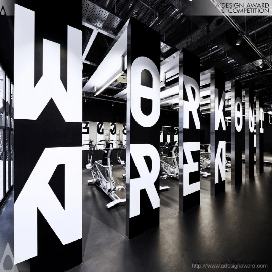
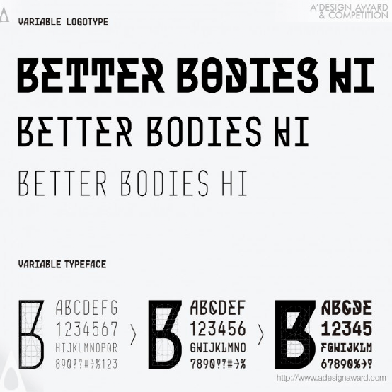
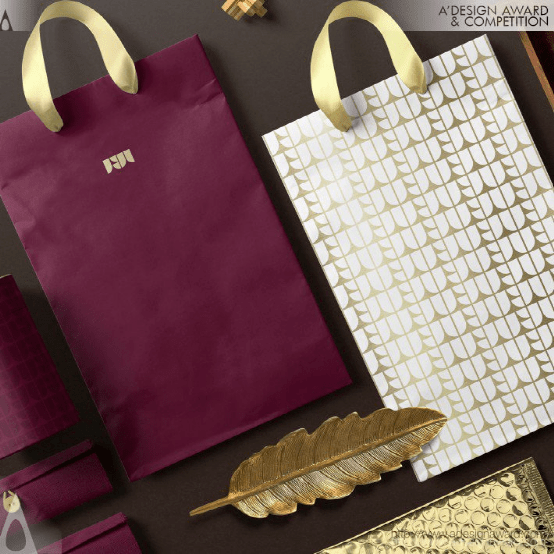
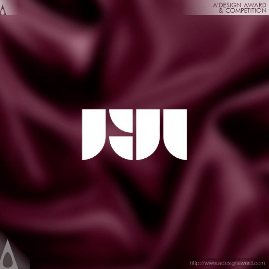
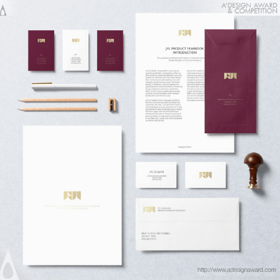
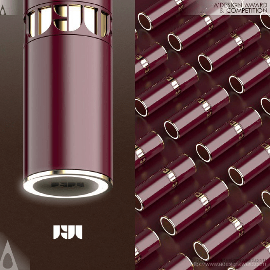
Better Bodies Hi Brand Identity by Takahiro Eto
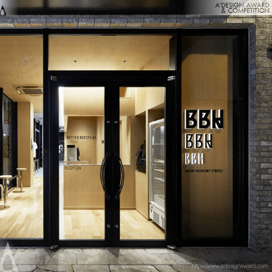
INSPIRATION:
Normally, the weight of a typeface changes, but its skeleton does not change significantly. For a long time, I have been wondering if it is possible to create a typeface whose skeleton also changes when its weight changes. Also, in general signage projects, the typeface used is limited in order to give a sense of unity to the space, but I was wondering if it would be possible to change the typeface to match the function of the space. These two ideas became the inspiration for this design.
灵感:
通常情况下,字体的重量会发生变化,但其骨架不会发生显著变化。很长一段时间,我一直在想,是否有可能创造一种字体,它的骨架也会随着它的粗细变化而变化。另外,在一般的标识项目中,字体的使用是有限的,为了给空间一种统一的感觉,但是我想知道是否可以改变字体来匹配空间的功能。这两个想法成为了本次设计的灵感。
Terra Coffee Roasters Branding by Akihito Shimizu
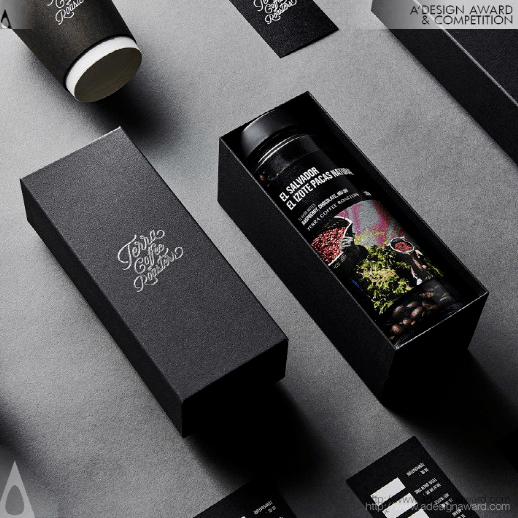
INSPIRATION:
Environment-oriented design development has finally become widespread in Japan, but it is still not enough. Communication designs such as logos, packages and tools incorporate high quality and ethical awareness in every respect. The mission is to "provide an experience as if you were in the production area". It wanted to embody a sincere attitude of pursuing design creatively and sustainably. The idea of design is to convey reality without abstraction. I felt that the expression was a simple and direct way to convey it to consumers.
灵感:
环境导向设计的发展终于在日本得到普及,但这还远远不够。诸如标识、包装和工具等沟通设计在各个方面都包含了高质量和道德意识。我们的使命是“提供一种体验,就像你在生产区域一样”。它想体现一种真诚的态度,追求创造性和可持续的设计。设计的理念是不抽象地传达现实。我觉得表达是一种简单直接的方式来传达给消费者。
Golden A' Design Award Winner for Graphics, Illustration and Visual Communication Design Category in 2021
金奖得主
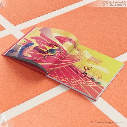
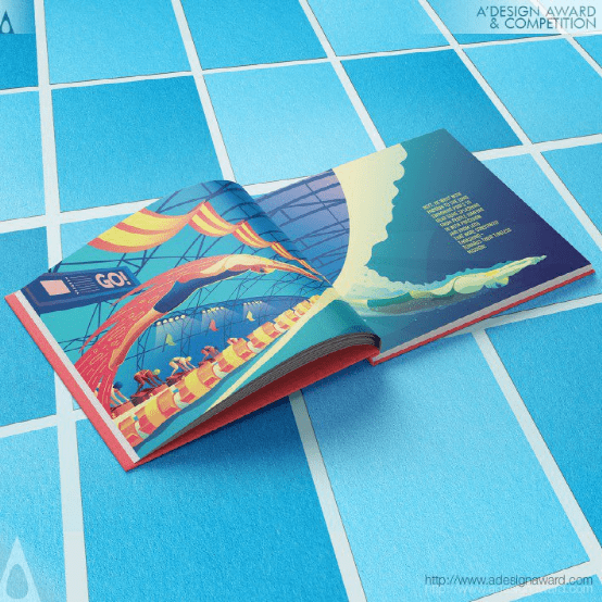
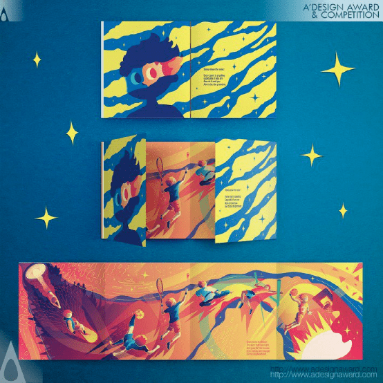
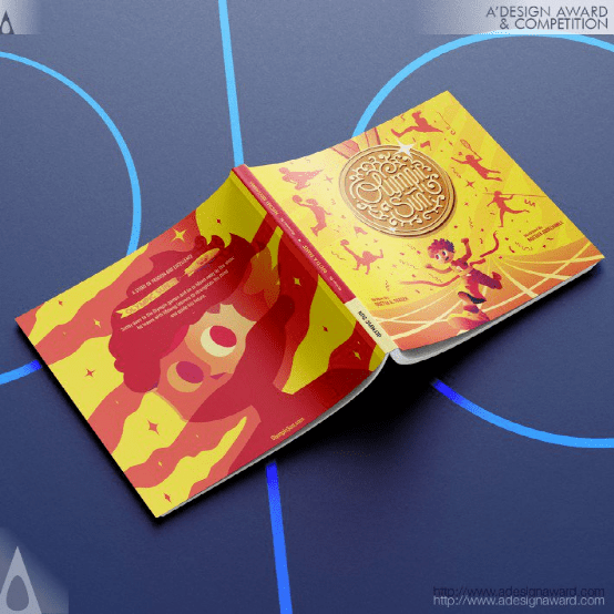
Olympic Sun Illustrated Book by Mostafa Abdelmawla
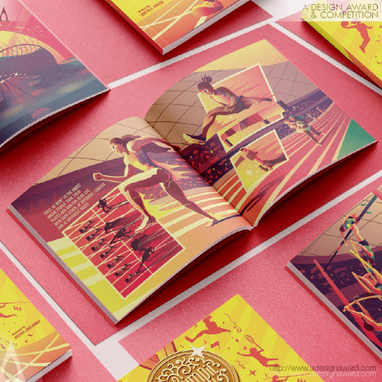
INSPIRATION:
Inspired by real figures from the history of the Olympic Games. The illustrator tried to capture some of their iconic moments and inspirational techniques throughout their career in the Olympic Games, and show them as heroes as they are for the younger generations. They are all proof that strength comes from within and it conquers any obstacle, pain, and injustice.
灵感:
灵感来自奥运会历史上的真实人物。这位插画家试图捕捉他们在奥运会职业生涯中的一些标志性时刻和鼓舞人心的技巧,并将他们作为英雄展现给年轻一代。它们都证明了力量来自内心,它克服了任何障碍、痛苦和不公。
Container Music Albums by Kam Kun Lam
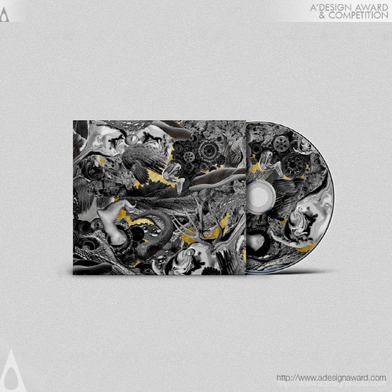
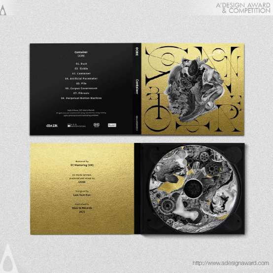
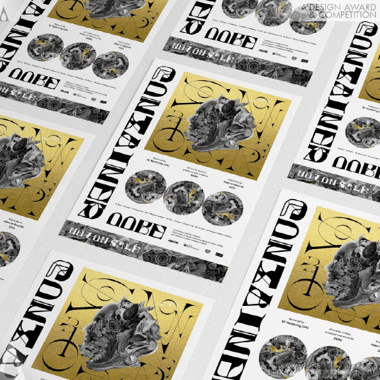
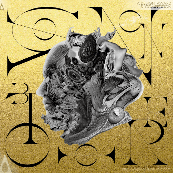
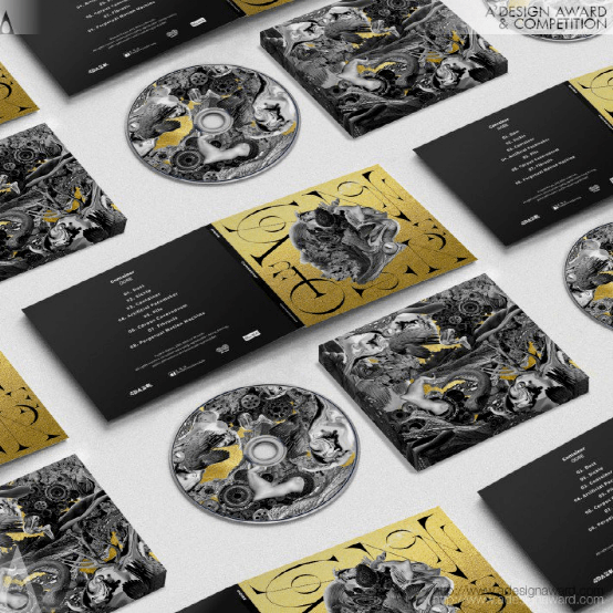
INSPIRATION:
This is an electronic music album with the theme of human and philosophy, mind and body. As the theme of this design, the visual combines classical aesthetics, philosophy and modern electronic music. The various natural elements are combined into a chaotic image, the classical style is boldly used, and then the realistic images are matched to create the final scheme.
灵感:
这是一张电子音乐专辑,主题是人与哲学、心灵与身体。作为本次设计的主题,视觉结合了古典美学、哲学和现代电子音乐。将各种自然元素组合成一个混沌的图像,大胆地使用古典风格,然后与真实的图像进行匹配,创造出最终的方案。
Biblioteche di Roma Rebranding by Ragu Communication
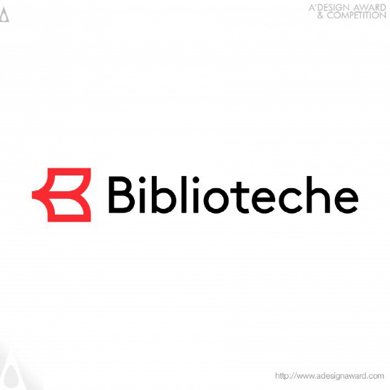
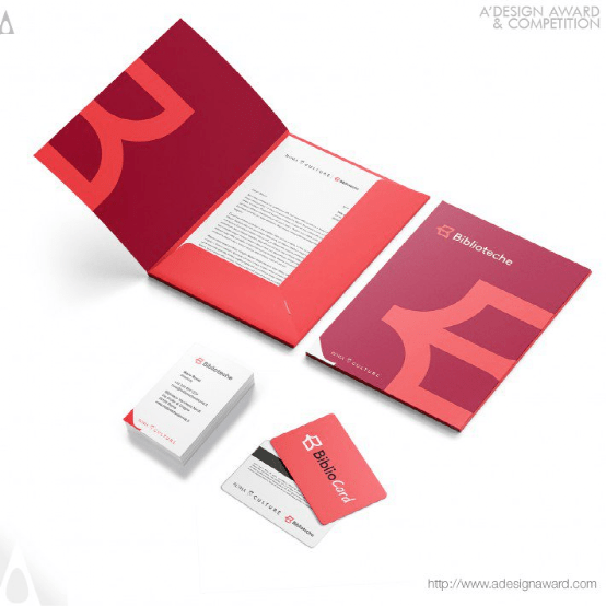
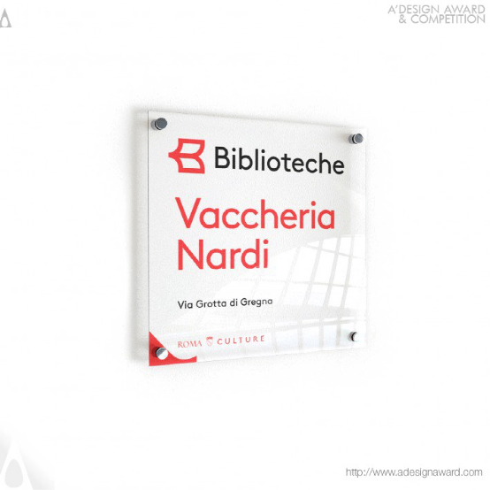
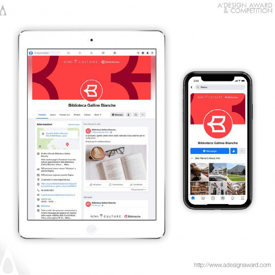
INSPIRATION:
In this new identity we find the book, already familiar from the historic logo - represented by the illustration of a closed book resting on its side - but with an important change: it is an open book, a powerful symbol of accessibility, because it is open and accessible to the entire Biblioteche network
灵感:
在这一新的身份中,我们发现这本书已经从历史性的标识中熟悉了――以一本放在一边的封闭书的插图为代表――但它有一个重要的变化:它是一本开放的书,一个可访问性的强大象征,因为它是开放的,整个Bibliotech网络都可以访问
Before the Midnight Hour Furniture Illustrations by Martin Reznik
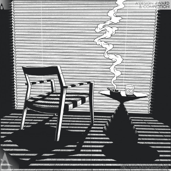
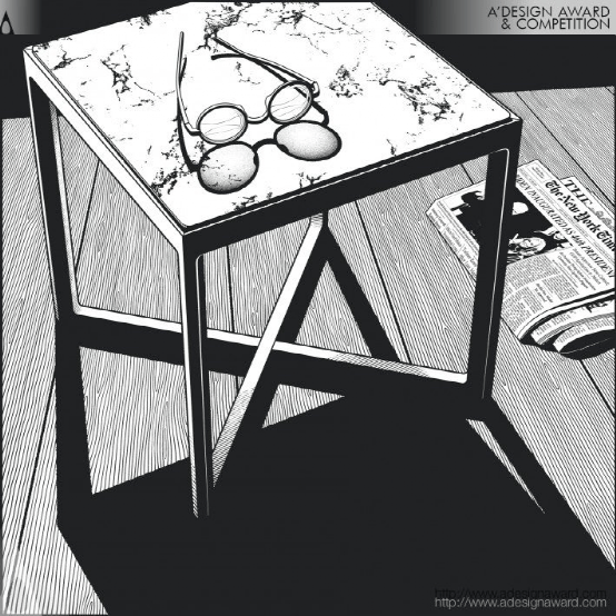
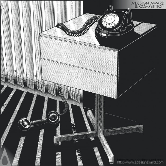
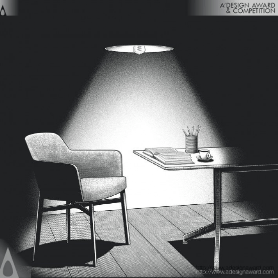
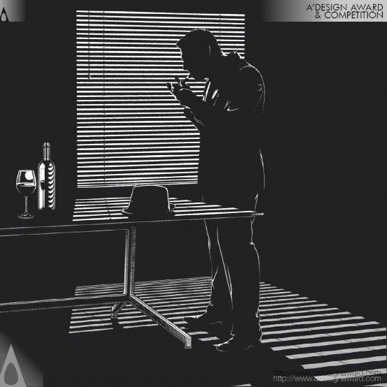
INSPIRATION:
Main inspiration for this project were comics and classic French noir cinema. The concept for the first illustration came from a reference photo I received from the client, which was a shot of a chair from behind and at a very low angle. It was very unusual and sparked loads of questions in my head. Being a fan of detective stories I decided to follow this approach in the layout of the image. The first image was crucial in setting the tone for the whole series.
灵感:
这个项目的主要灵感来自漫画和经典的法国黑色电影。第一张插图的概念来自我从客户那里收到的一张参考照片,这是一张从椅子后面以非常低的角度拍摄的照片。这很不寻常,在我脑海中引发了一大堆问题。作为一名侦探小说迷,我决定在图像的布局上遵循这种方法。第一张图片对整个系列的基调至关重要。
Silver A' Design Award Winner for Graphics, Illustration and Visual Communication
银奖得主
OCT Happy Hour Wayfinding Signs by updesign
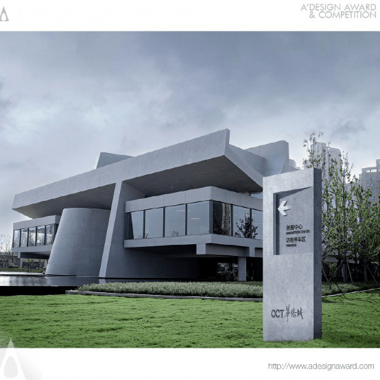
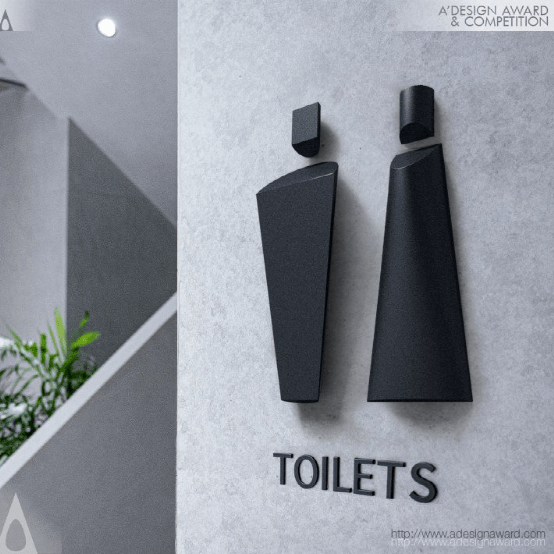
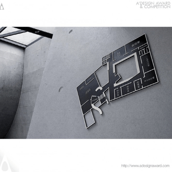
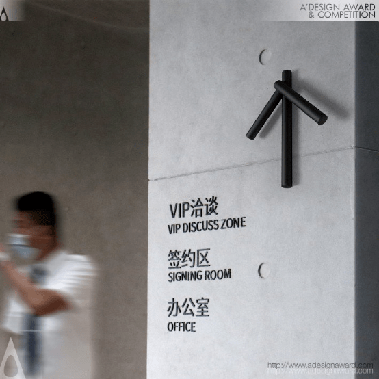
INSPIRATION:
The project is designed for the demonstration area of a large park-themed residence with Corbusier’s modernist architectural style. It’ll be transformed into a local culture center after residential deliveries. UPD extracts Corbusier architectural language into wayfinding-sign design on landscaping belts and entrance paths. It makes aesthetic architectural aura easily available everywhere in a vivid way. A more 3D space experience is ingeniously created by the wayfinding signs here and there.
灵感:
该项目是为科布西耶现代主义建筑风格的大型公园主题住宅示范区设计的。住宅交付后,它将被改造成当地的文化中心。UPD将Corbusier建筑语言引入景观带和入口通道的指路标志设计中。它使美学建筑氛围以生动的方式随处可见。这里和那里的指路标志巧妙地创造了一种更为3D的空间体验。
Across Poster by Xuguang Zhu and Chao Yang
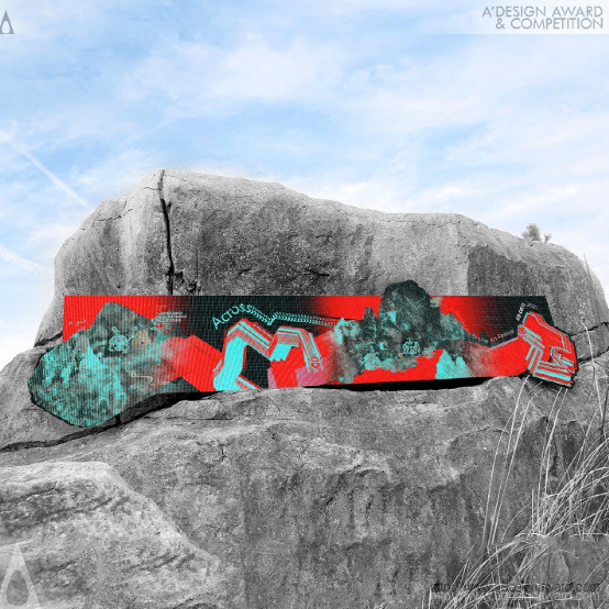
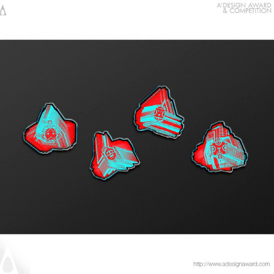
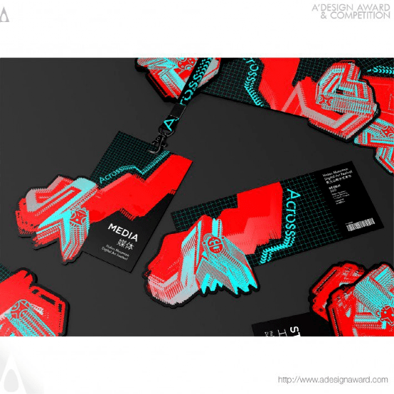
INSPIRATION:
Holan mountain rock painting is a precious ancient civilization heritage of China. Nowadays, due to environmental reasons, it is gradually disappearing, but many people still don't know its existence. Therefore, I have planned a digital art festival of Holan Mountain with the theme of across. The main visual performance of this festival is to redesign the rock paintings digitally as a kind of digital protection, so that they can be spread and applied in the contemporary era and play the contemporary value of ancient culture.
灵感:
贺兰山岩画是我国宝贵的古代文明遗产。如今,由于环境原因,它正在逐渐消失,但许多人仍然不知道它的存在。因此,我计划举办一个以跨越为主题的贺兰山数字艺术节。本次艺术节的主要视觉表现是对岩画进行数字化重新设计,作为一种数字化保护,使其在当代得以传播和应用,发挥古代文化的当代价值。
Wind Art Museum logo by Yong Huang
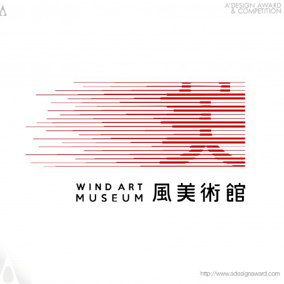
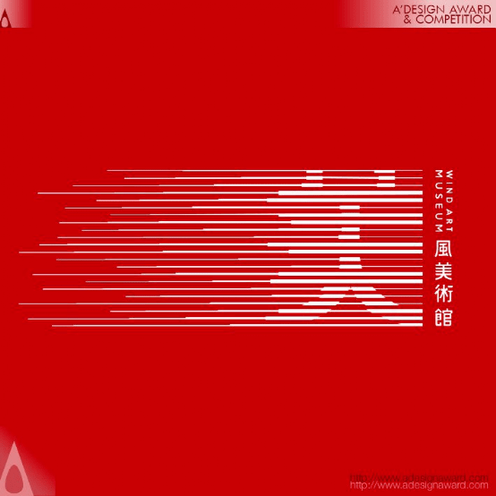
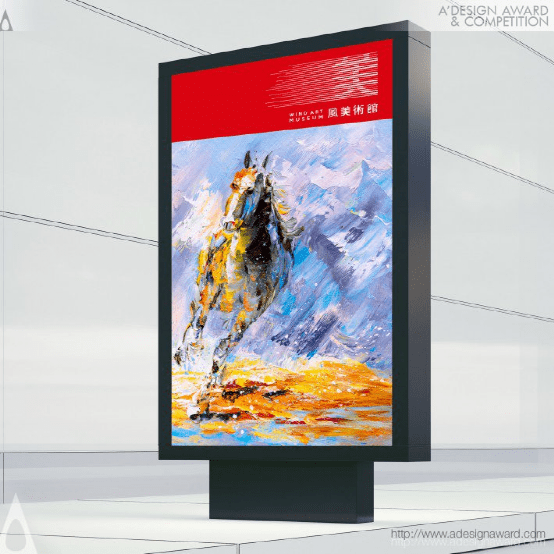
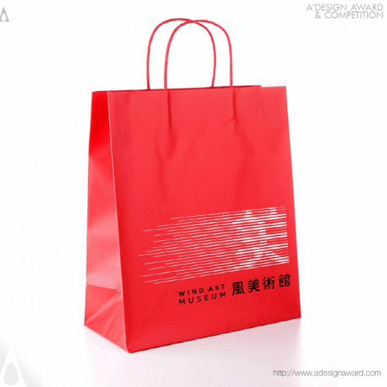
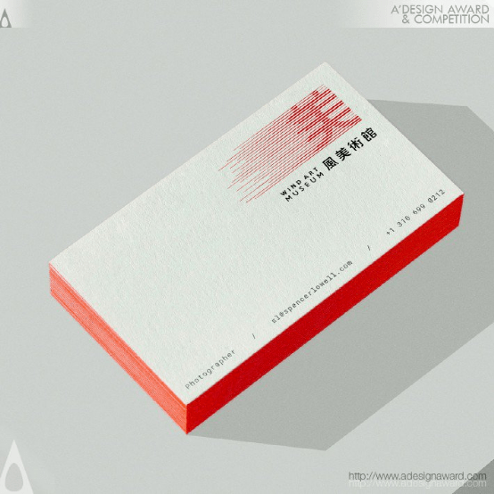
INSPIRATION:
Feng Art Museum implements a membership system, with aesthetic improvement and art promotion as its two wings: on the one hand, it cultivates entrepreneurs and other people from all walks of life who love art, and guides them to enter the field of collection through aesthetic improvement; on the other hand, it discovers more young and outstanding artists, Support and promote their entry into the art market.
灵感:
冯氏美术馆实行会员制,以美感提升和艺术推广为两翼:一方面培养热爱艺术的企业家和各界人士,通过美感提升引导他们进入收藏领域;另一方面,它发现了更多年轻杰出的艺术家,支持和推动他们进入艺术市场。
Gung Ho Illustration by Thomas von Kummant
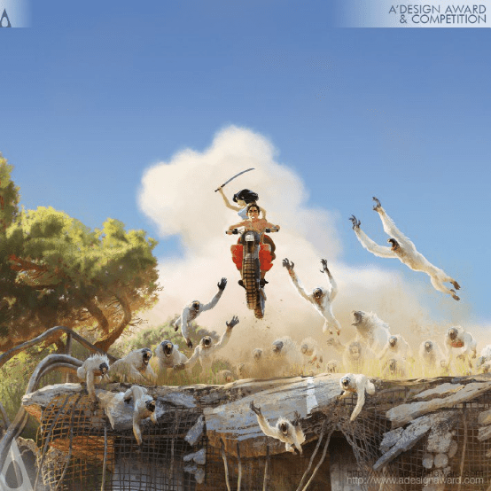
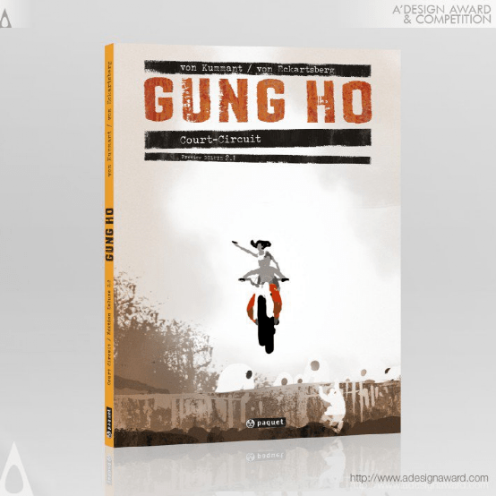
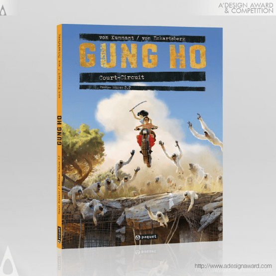
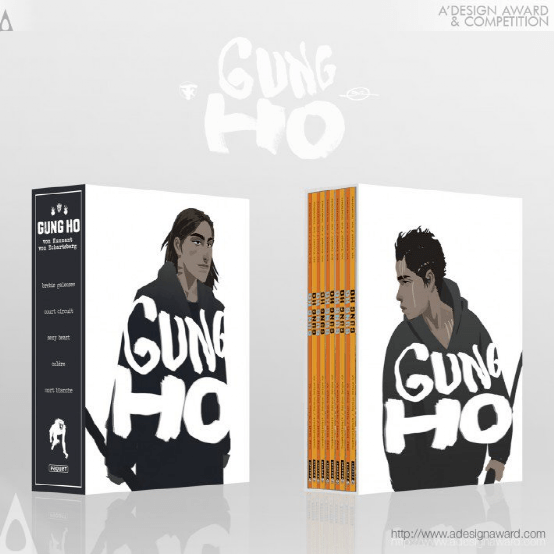
INSPIRATION:
The inspiration came from our kids and the question - What if nature stroke back created a new aggressive species? The fictive story is telling happenings in a post apocalyptic south europe, where survival is only possible in fortified cities and settlements. Following the rules is a matter of life and death. Every child knows that. Until he becomes a teenager… The theme of Gung Ho is on one hand about the destructive side of youth, but also on the other hand its power for renewal.
灵感:
灵感来自我们的孩子和一个问题――如果大自然的反击创造了一个新的侵略物种呢?这个虚构的故事讲述的是后世界末日时代的南欧发生的事情,那里只有在设防的城市和定居点才能生存。遵守规则事关生死。每个孩子都知道这一点。在他成为一名青少年之前……工合的主题一方面是关于青春的毁灭性一面,另一方面也是关于青春的新生力量。
Lab Future Construction Event Identity by Yu-Chi Chen
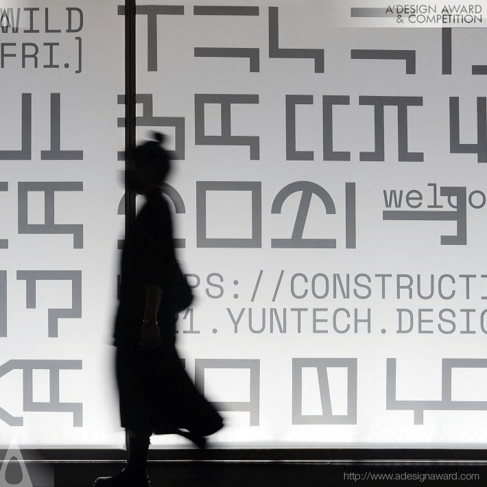


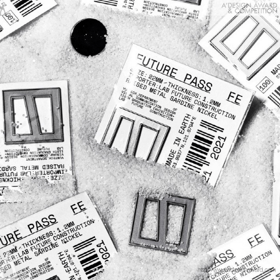
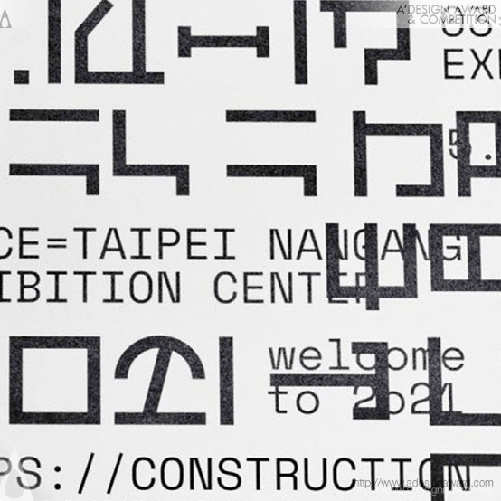
INSPIRATION:
With the development of the global network, the distances and languages on Earth are no longer barriers as to communication with outer space. Therefore, the next subject established will be communication from the outer space. The creators explored the civilizations of the universe from the perspective of an alien observer, by reconstructing the current notes, signs, and symbols to develop a new language called Hou-Ru wen, which will be used to communicate with other planets in outer space.
灵感:
随着全球网络的发展,地球上的距离和语言不再是与外层空间交流的障碍。因此,下一个确定的主题将是来自外层空间的通信。创造者们从外星观测者的角度探索了宇宙文明,通过重建当前的音符、符号和符号,开发出一种新的语言,称为“侯汝文”,将用于与外层空间的其他行星交流。
Tsubasa.Y Brand Integration bySiwei Lai
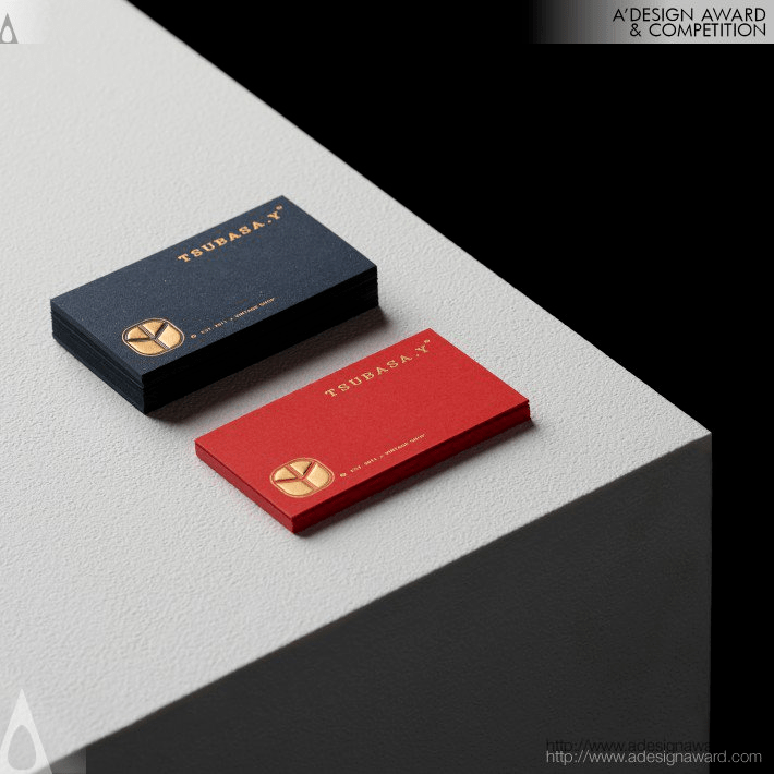
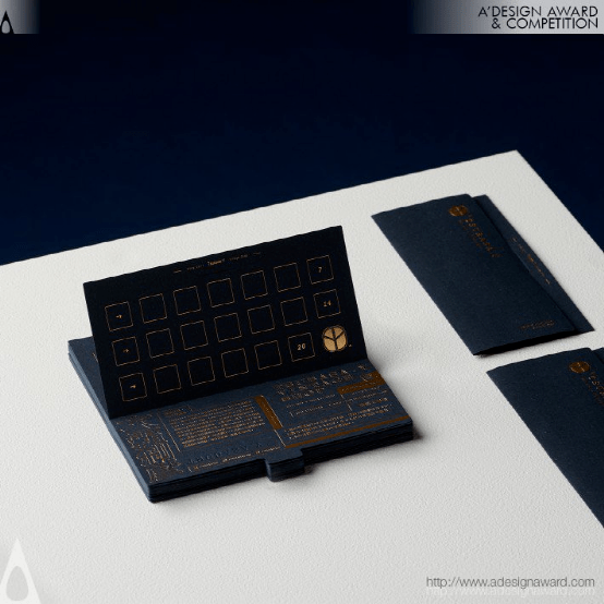
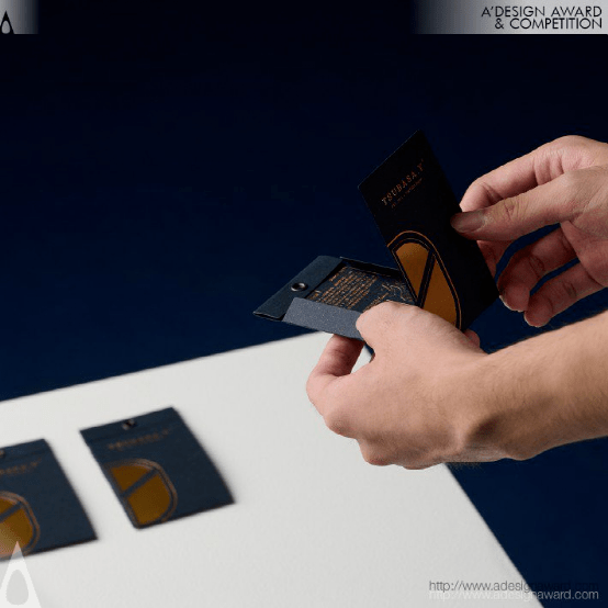
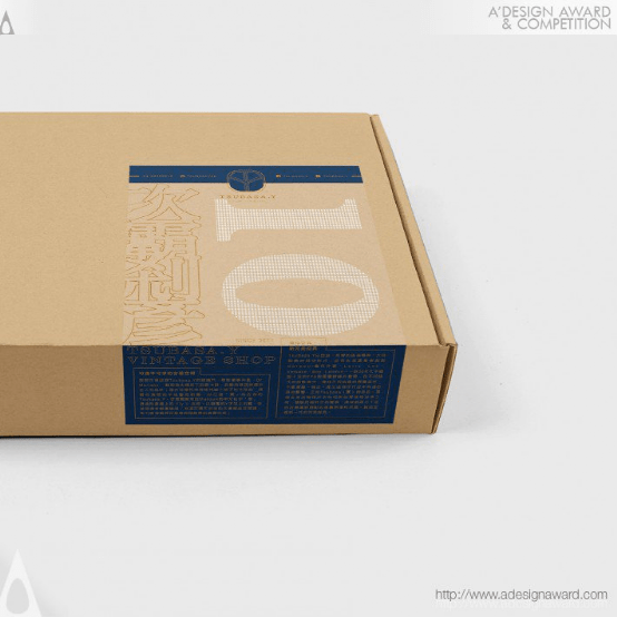
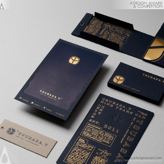
INSPIRATION:
In the identification design, the initials of the brand name "TSUBASA" (Japanese meaning wings) and Y are the main shape combinations, and the main shape is formed like a bird spreading its wings. Use simple lines to create a sense of refinement and quality.
灵感:
在标识设计中,商标名“TSUBASA”(日文意为翅膀)和Y的首字母缩写是主要的形状组合,主要形状像一只展翅的鸟。使用简单的线条来营造精致感和品质感。
Q Shinshu Apple Pie Laboratory Brand Identity by Nobuya Hayasaka
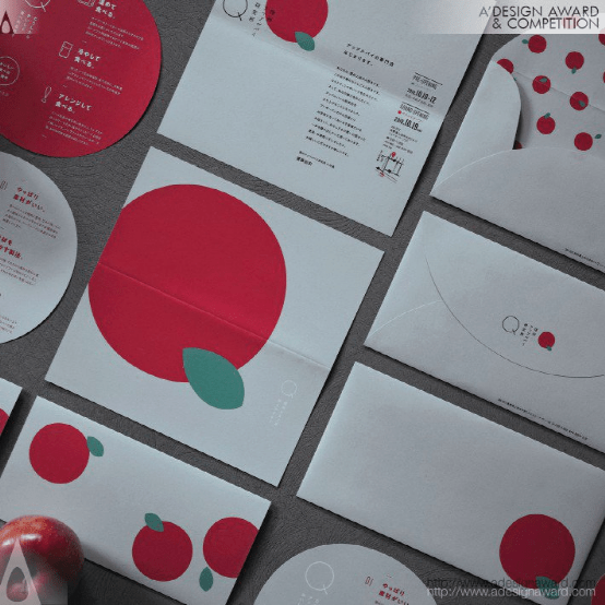
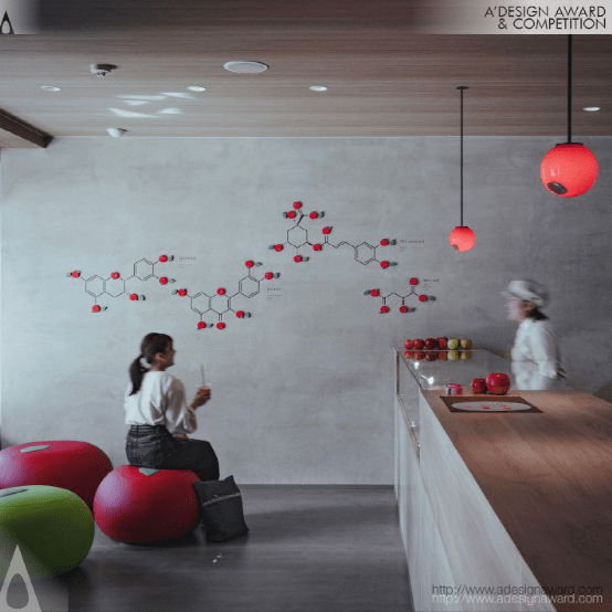
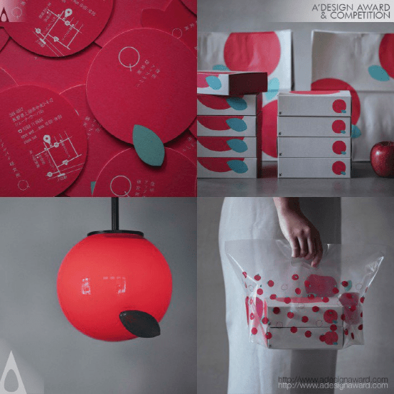
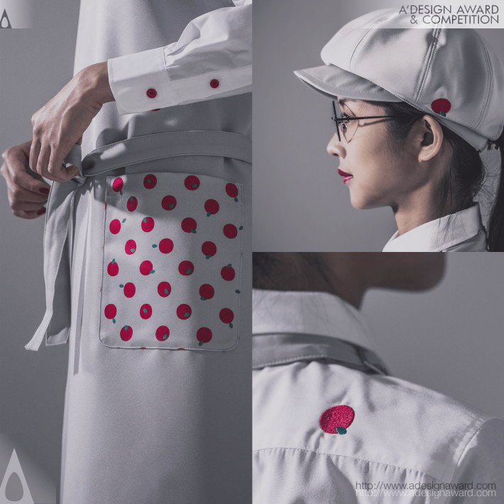
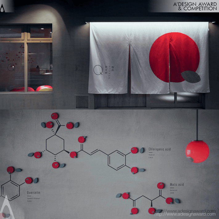
INSPIRATION:
The store does not use any extra processing or seasoning so that consumers can appreciate the taste of the apples themselves. In order to convey the brand's vision and spirit of "cherishing the original taste of apples," I designed a simple symbol without any unnecessary decoration. To match this concept, I designed the interior without coloring, using the colors of the concrete and wood as they are.
灵感:
这家商店不使用任何额外的加工或调味品,以便消费者能够亲自品尝苹果的味道。为了传达该品牌“珍惜苹果原汁原味”的愿景和精神,我设计了一个简单的符号,没有任何不必要的装饰。为了配合这一理念,我设计了不着色的内部,使用混凝土和木材的颜色。
The River Runs Through Public Art byBeck Storer
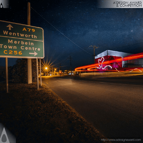
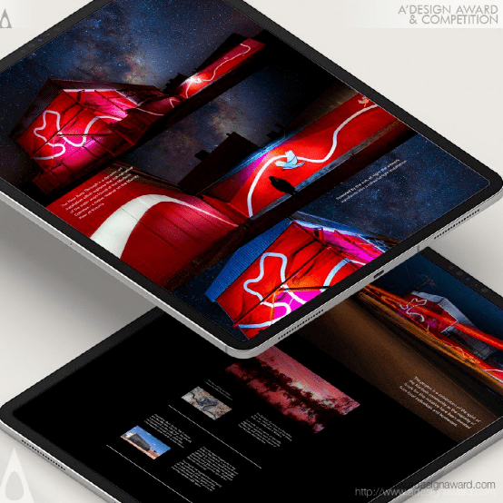
INSPIRATION:
The artwork is inspired by the unique landscape of the Australian outback in regional Victoria and the Murray River, the longest river in Australia. It pays homage to a particular area on the Murray known as the Merbein Common. The Merbein Common is a floodplain reserve, nestled in a bend of the Murray River just north-west of Mildura. It is made up of a series of nationally significant wetlands, such as Cowanna Billabong.
灵感:
这件艺术品的灵感来自维多利亚地区澳大利亚内陆的独特景观和澳大利亚最长的河流默里河。它向默里河上被称为默拜因公地的特定区域致敬。梅尔宾公地是一个洪泛平原保护区,坐落在米尔杜拉西北部默里河的一个弯曲处。它由一系列具有全国意义的湿地组成,比如考安娜比拉邦。
Sxdesign Brand Identity by Sxdesign
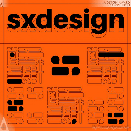
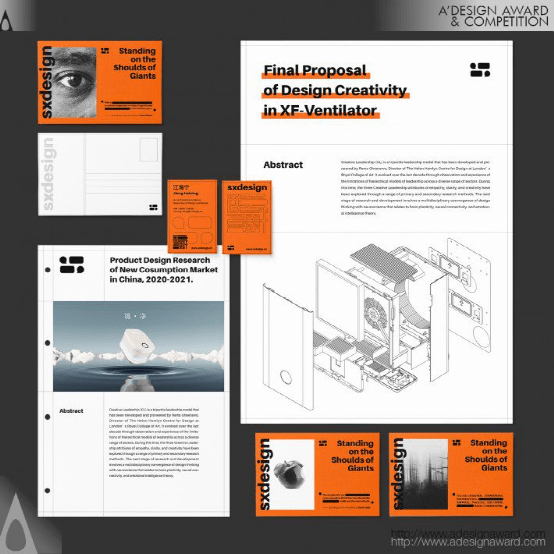
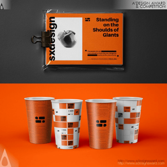
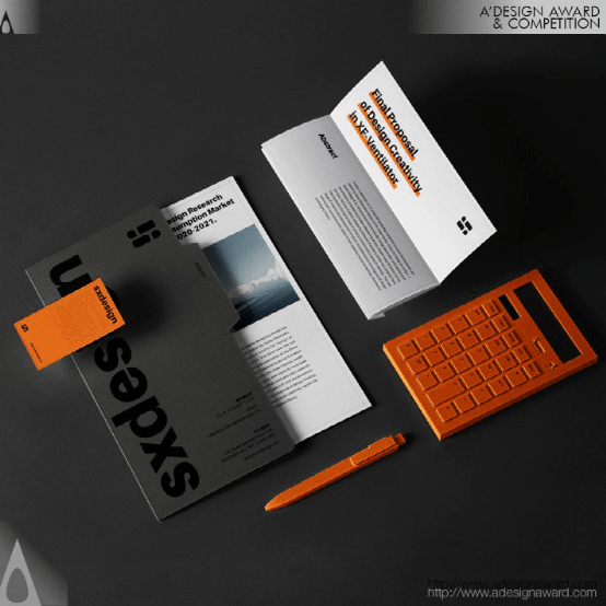
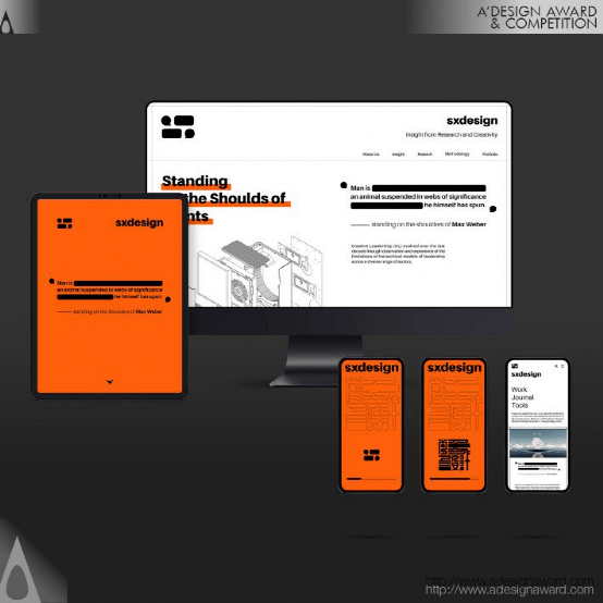
INSPIRATION:
As a design studio in China, “SX” stands for Chinese “ShangXiang” which taken from “Yi Chuan”. The name expounds the brand core opinion: To build significance of daily life through the observation, extraction, abstraction and reorganization of phenomena. We think the role of human language is the same too. So, we excite people's imagination of language to express the culture of the brand and to build a connection between the logo and the Chinese name.
灵感:
作为中国的一家设计工作室,“SX”代表中国的“尚香”,取自“宜川”。该名称阐述了品牌的核心观点:通过对现象的观察、提取、抽象和重组,构建日常生活的意义。我们认为人类语言的作用也是一样的。因此,我们激发人们对语言的想象力来表达品牌文化,并在商标和中文名称之间建立联系。
Nel Typeface byJasper Nijssen

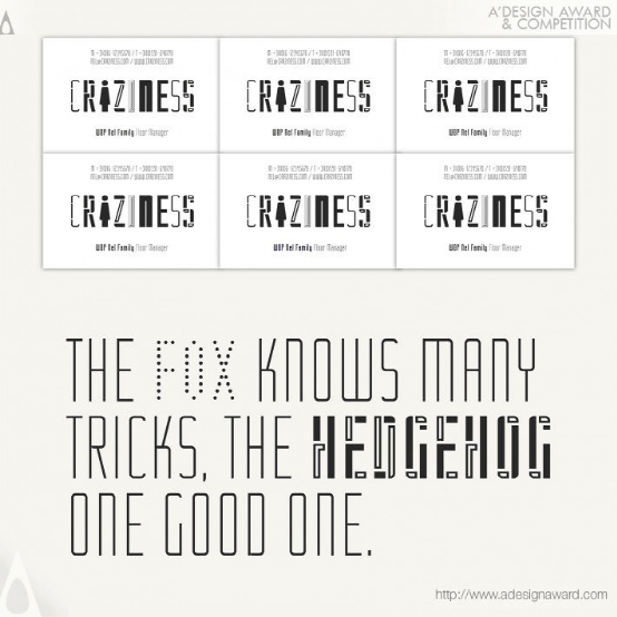
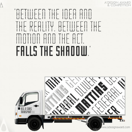
INSPIRATION:
During the "mixing and matching" of a few typefaces, the question arose: Wouldn't it be nice for a typeface to have a regular style for the body text and some eccentric, fun versions for headers or high-lighted text? This typeface would make it possible to use different styles and still be coherent.
灵感:
在对几种字体进行“混合和匹配”的过程中,出现了一个问题:如果一种字体的正文采用常规样式,而标题或高亮文本采用一些古怪、有趣的版本,那不是很好吗?这种字体可以使用不同的样式,并且仍然保持连贯性。
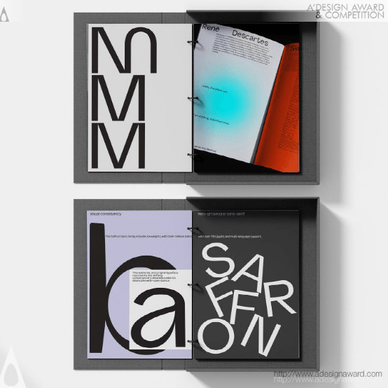
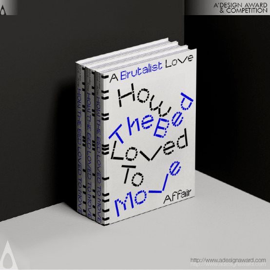
Type Specimen Alskar Typeface by Paul Robb and Moira Bartoloni
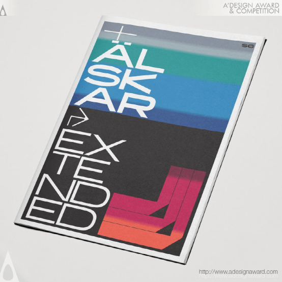
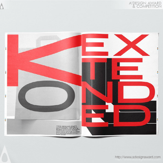
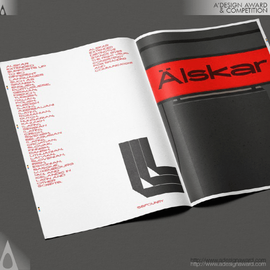
INSPIRATION:
The inspiration for the typeface was to design a character set with a contemporary feel with a strong aesthetic feel of the Brutalist movement. The idea was to develop a versatile font that would give the right visual consistencies to brand ranging from high fashion to artistic communications
灵感:
字体的灵感是设计一个具有当代感的角色集,带有强烈的野蛮主义运动审美感。其想法是开发一种多功能字体,为品牌从高端时尚到艺术传播提供正确的视觉一致性
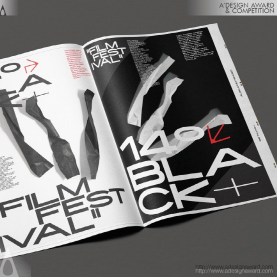
Audio Technica Excellence Poster by Ligh.
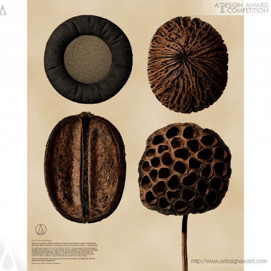
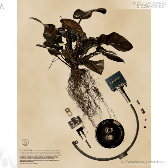
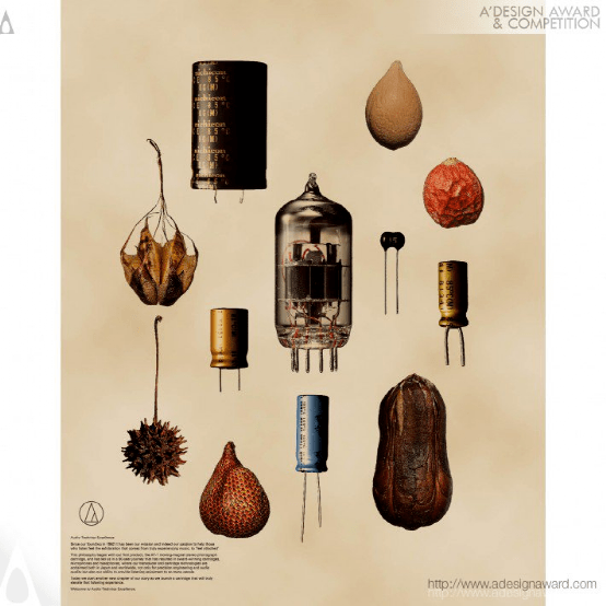
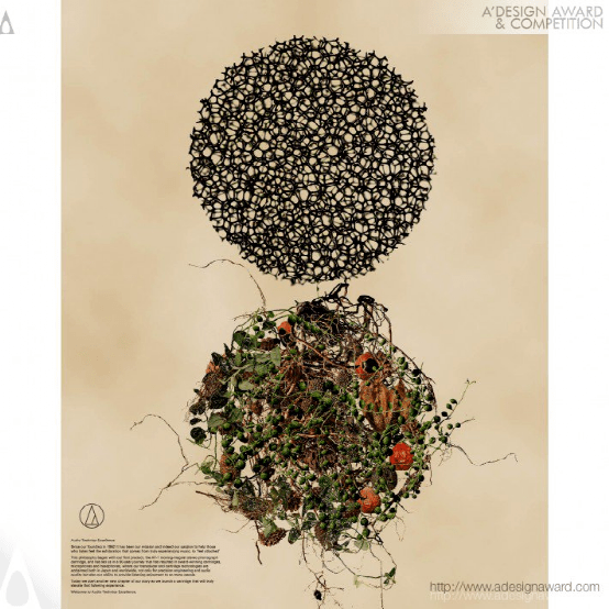
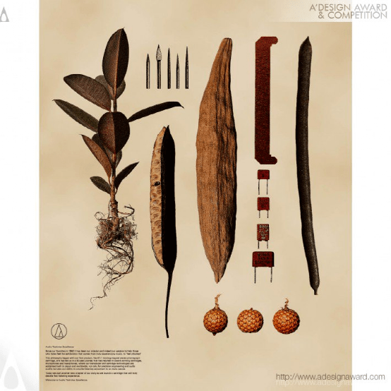
INSPIRATION:
When observing the parts that make up the product and the natural grass, We found common ground in the shape and color of the fine details. When both were laid out flat, Incompatible things resonated with each other, creating a unique world.
灵感:
当我们观察产品和天然草的组成部分时,我们在细节的形状和颜色上找到了共同点。当两者都被平放时,不相容的事物彼此产生共鸣,创造了一个独特的世界。
Kanji Posters Posters by Alice Xi Zong
INSPIRATION:
Inspired by Chinese Calligraphy strokes, the study of contextual ideas, blend of styles, and cultural attention. This exploration shows exquisite elegance and luxuriant cultural implications of Chinese calligraphy.
灵感:
灵感来源于中国书法笔触、对语境思想的研究、风格的融合和文化关注。这种探索展示了中国书法的精致优雅和丰富的文化内涵。
Archadia Brand Identity by Cristian Carrara
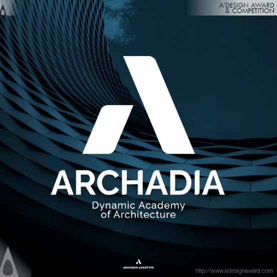
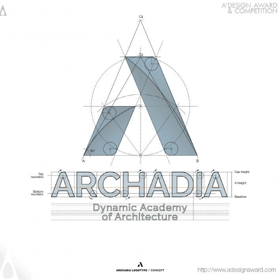
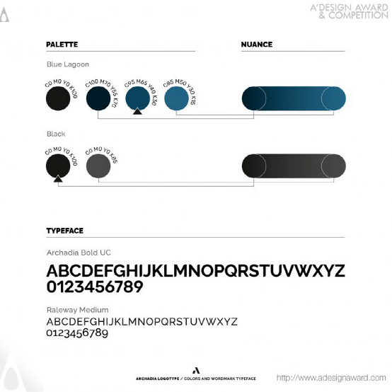
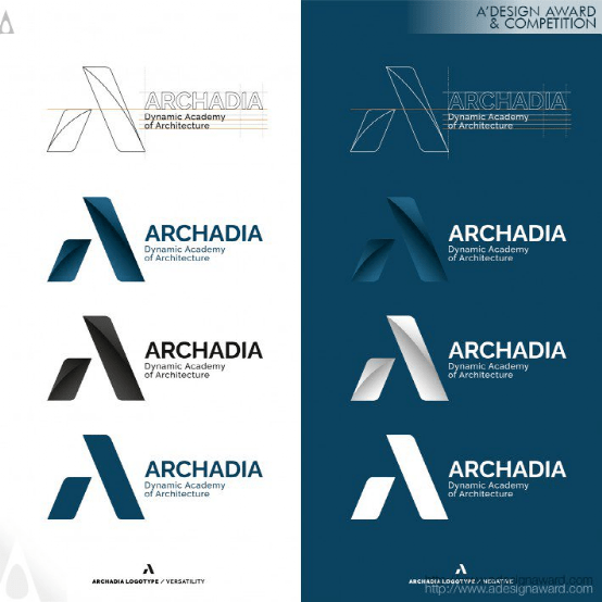
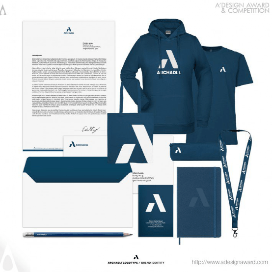
INSPIRATION:
The inspiration came from the letter A of the name, but also from the words that generated it and that contain the mission of the school such as Architecture, Academy, Abitare (Living) and Archos, the architecture studio that deals with the management of masters and courses. A static but dynamic "A" at the same time transmitting stability and strength in a contemporary guise. The form starts from the elementary geometry of a triangle, the static form par excellence in architecture. The blue recalls its institutional role but also the colors of Venice lagoon, headquarters of the academy.
灵感:
灵感来源于名字的字母A,但也来源于产生它的单词,以及包含学校使命的单词,如建筑、学院、生活(Abitare)和建筑工作室Archos,该工作室负责管理大师和课程。一个静态但动态的“A”,同时以当代的姿态传递稳定和力量。形式从三角形的基本几何图形开始,这是建筑中最优秀的静态形式。蓝色让人想起了它的机构角色,但也让人想起了学院总部威尼斯泻湖的颜色。
Animal Deadee Stamp Illustration by Southwest Forestry University
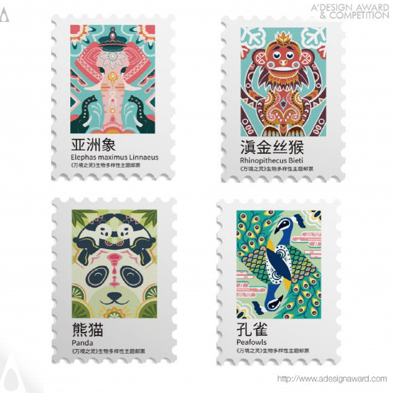
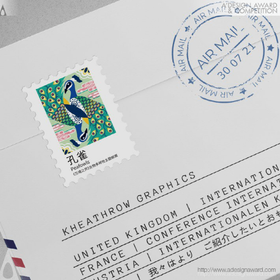
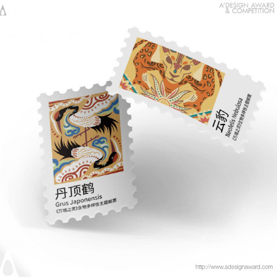
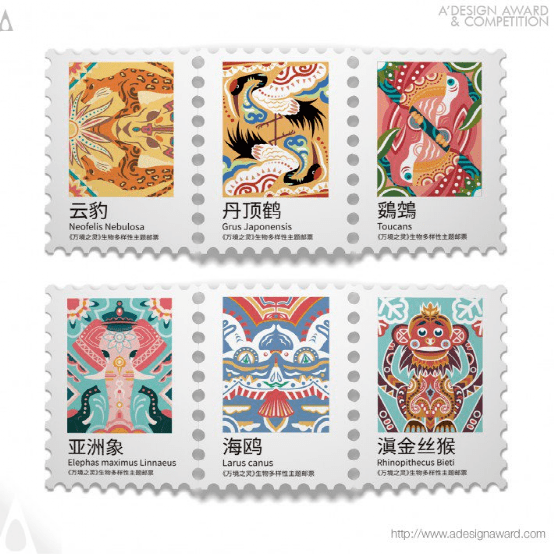
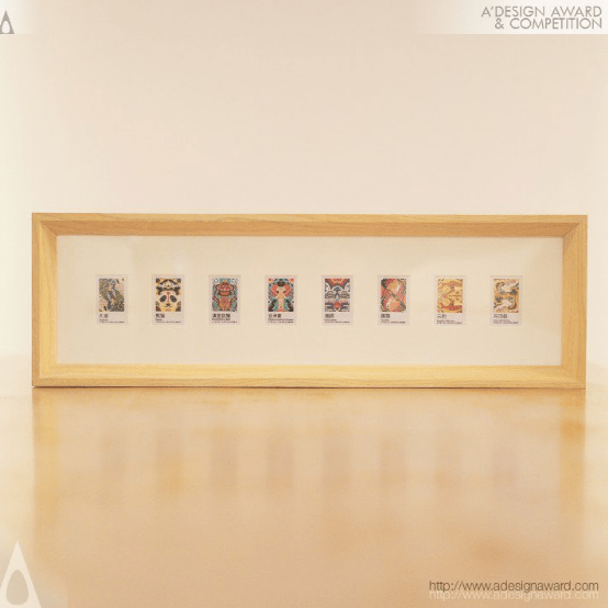
INSPIRATION:
Due to modern human activities, many rare species are on the verge of extinction. Global climate anomalies and natural disasters in recent years have been a strong warning signal to humanity. It is hoped that the stamp will evoke human love for endangered animals and nature in the process of use. The design is inspired by Chinese poetry.
灵感:
由于现代人类活动,许多稀有物种濒临灭绝。近年来,全球气候异常和自然灾害一直是对人类的强烈警告信号。希望这枚邮票在使用过程中唤起人们对濒危动物和大自然的热爱。设计灵感来自中国诗歌。
Mamba Chiliast Brand Identity by Sxdesign
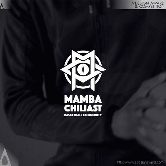
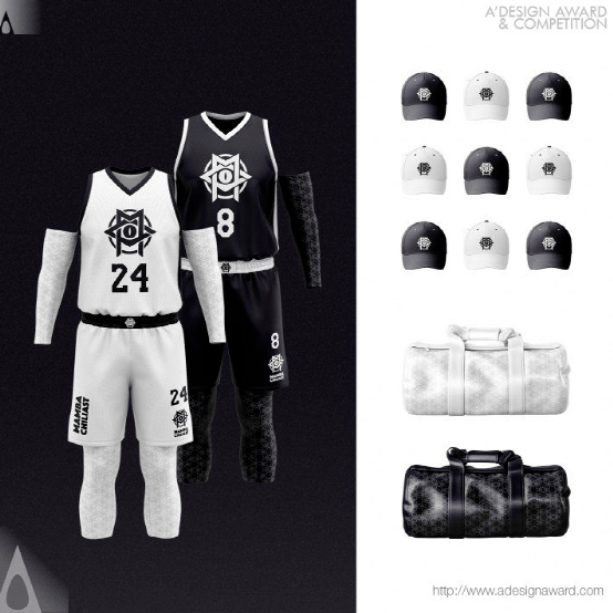
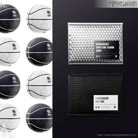
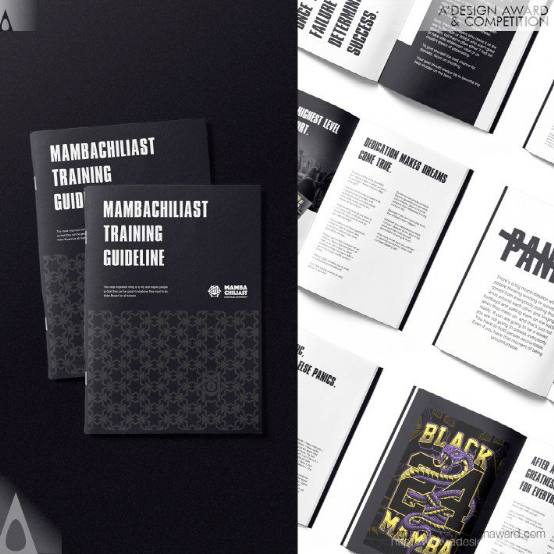
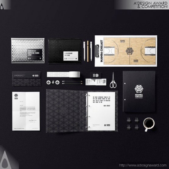
INSPIRATION:
The logo uses the shape of hexagram as the visual framework, and the letters M and C in it combine to form the shape. This design intuitively calls people's collective memory and conveys comprehensive feelings about religion, organization, and energy. The eye of Mamba in the logo, as the visual center, lights up the visual framework of the logo. The eye, representing the Mamba, serves as a reminder that fans' thoughts and deeds are always seen by their hero. This design is reminiscent of 'the eye of providence' and calls more people's collective memory.
灵感:
该标志使用六边形作为视觉框架,其中的字母M和C组合形成形状。这种设计直观地调用了人们的集体记忆,传达了对宗教、组织和能量的全面感受。标志中的曼巴之眼作为视觉中心,照亮了标志的视觉框架。代表曼巴的眼睛提醒人们,粉丝们的想法和行为总是被他们的英雄看到。这种设计让人想起“上帝之眼”,并唤起更多人的集体记忆。
Dona Vitamina Branding by Ruis Vargas
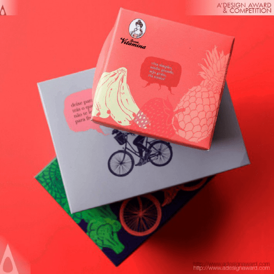
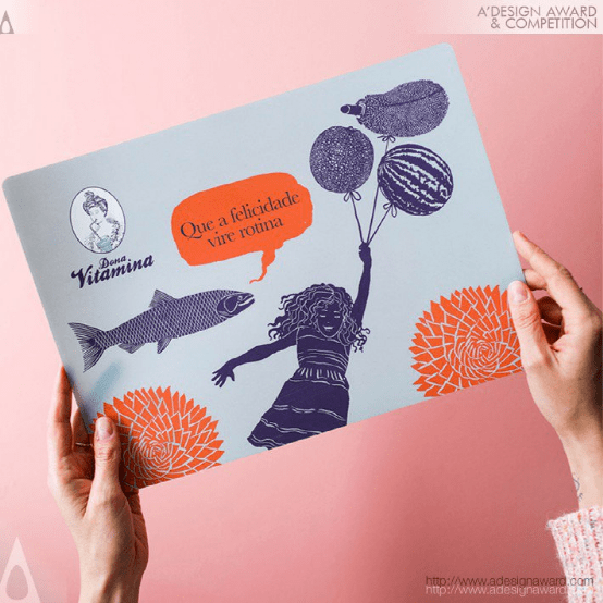
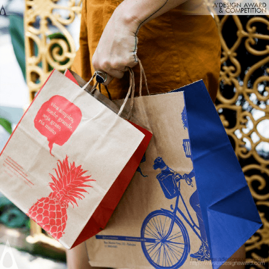
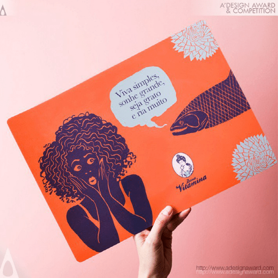
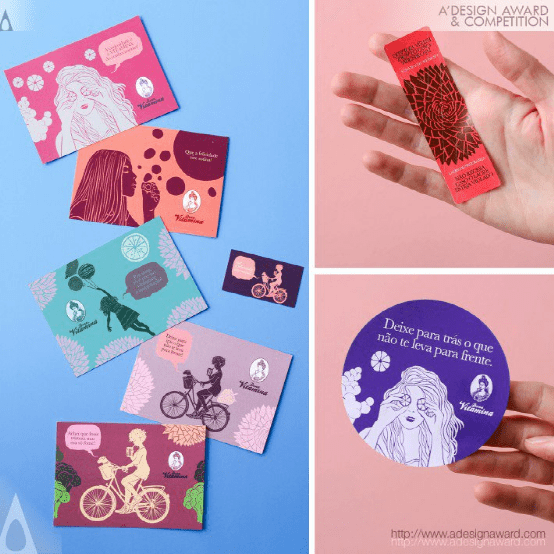
INSPIRATION:
Dona Vitamina was need to change its branding language while preserving its original essence of humor (the logotype is a cross-eyed Victorian lady sipping a juice) and the genesis of female empowerment present since the begin. A series of narratives with women was created, building other Donas Vitaminas, which contemplate different ethnicities and feminine manners. Scattered across surface design, packaging, menus and more, these women are the epitome of the brand's fun and timeless spirit.
灵感:
Dona Vitamina需要改变其品牌语言,同时保留其最初的幽默本质(标识是一位斗鸡眼的维多利亚女士啜饮果汁),以及从一开始就存在的女性赋权的起源。创作了一系列关于女性的叙事,构建了其他多纳斯・维塔米纳斯(Donas Vitaminas),其中考虑了不同的种族和女性礼仪。这些女性分散在表面设计、包装、菜单等方面,是该品牌乐趣和永恒精神的缩影。
Cloud Mountain Type Type Design by Meng Shenhui
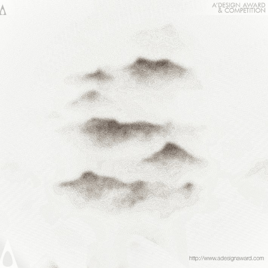
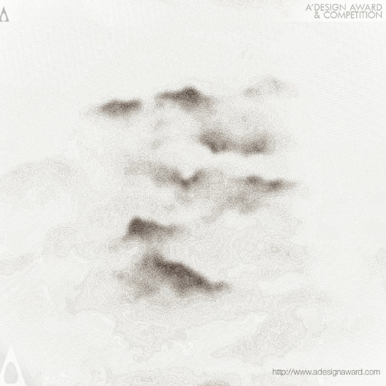
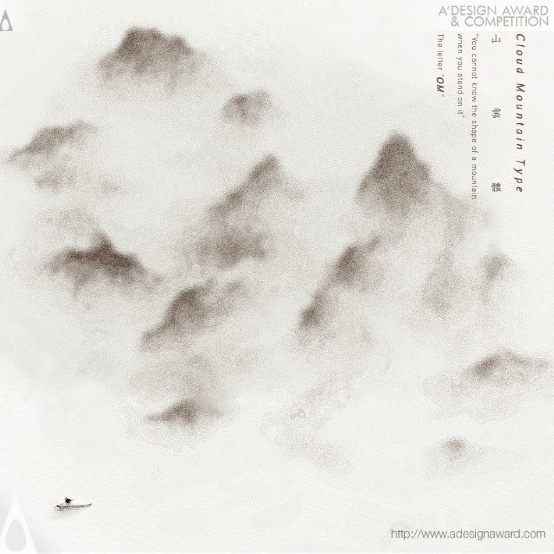
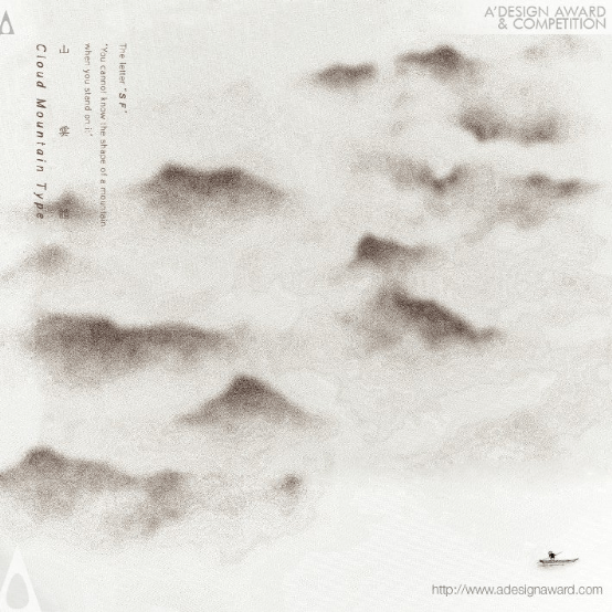
INSPIRATION:
The Cloud Mountain Type inspired by Zhang Jiajie, the Chinese cloud-fog mountains and ancient Chinese landscape painting. Combined the traditional Chinese clouds landscape with western character.
灵感:
云山类型灵感来源于张家杰、中国云雾山和中国古代山水画。将中国传统的云彩景观与西方特色相结合。
Can You See the Music Dynamic Identity by Brand Bar Communications
INSPIRATION:
The idea was inspired by some favoured piece of music in the orchestra’s repertoire. By bending the five-line sheet music system into a circle, a brand-new musical language and design concept was created. Virtually any piece of music can be notated this way, meaning it can be visualized within the set of guidelines defined by the designers. Making music visible to anyone. Due to the dynamic nature of the identity, each member of the orchestra could create their own personalized logo.
灵感:
这个想法的灵感来源于管弦乐队曲目中一些受欢迎的音乐。通过将五行乐谱系统弯曲成一个圆圈,创造了一种全新的音乐语言和设计理念。事实上,任何一段音乐都可以用这种方式来表示,这意味着它可以在设计师定义的一套指导方针内可视化。让任何人都能看到音乐。由于身份的动态性,乐团的每个成员都可以创建自己的个性化标志。
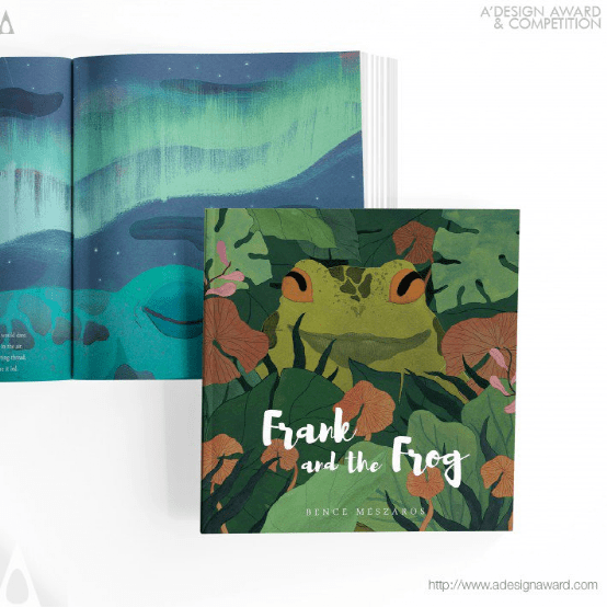
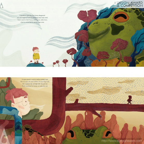
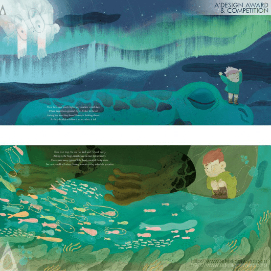
Frank and the Frog Picture Book for Children by Bence Meszaros
INSPIRATION:
My main goal with this picture book was to tell a story and tackle a topic that is not that common in children's literature. A topic that was hard to understand when I was a kid and had me confused for a long time. The subject of death. I am lucky to have all four of my grandparents alive and know them, but this is a rare phenomenon in my environment. Many people lose their grandparents during their childhood. The base idea comes from my childhood: I was always (and still am) scared of what would happen when my grandparent won't be here anymore.
灵感:
我用这本图画书的主要目的是讲一个故事,并解决一个在儿童文学中并不常见的话题。这是一个我小时候很难理解的话题,让我困惑了很长一段时间。死亡的主题。我很幸运,我的四位祖父母都还活着,并且认识他们,但在我的环境中,这是一种罕见的现象。许多人在童年时期失去了祖父母。基本的想法来自我的童年:我一直(现在仍然)害怕当我的祖父母不再在这里时会发生什么。
Villa Sorra Branding by Amr Ibrahim Mousa
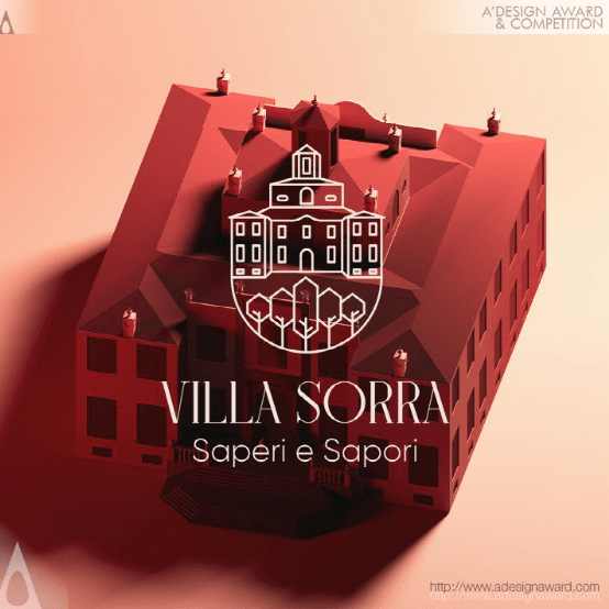
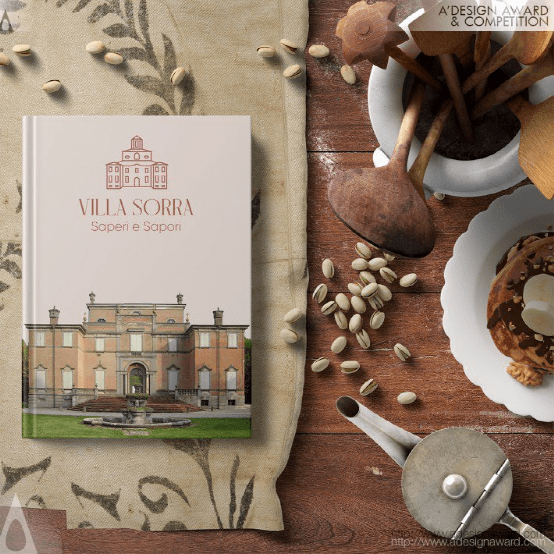
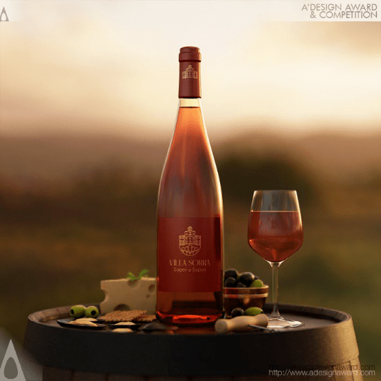

INSPIRATION:
The logo refers to the historical, architectural, and landscape characteristics of the Villa. The logo creation is a mirror. It is a symbol that shows the values of the area of Emilia and Italy to the world. It is the business card that will be imprinted in people’s memory. It will create a sense of awareness and belonging.
灵感:
标志是指别墅的历史、建筑和景观特征。标志创作是一面镜子。这是一个向世界展示埃米利亚和意大利地区价值观的符号。这是一张将铭刻在人们记忆中的名片。它将创造一种意识和归属感。
Bank of England Visual Identity by Matteo Ruisi and Peter McCabe
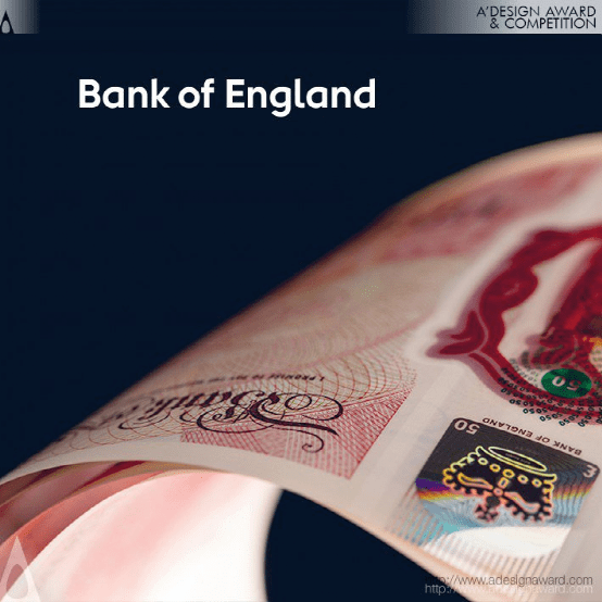
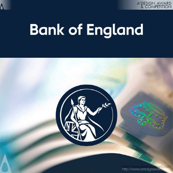
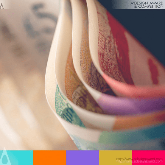
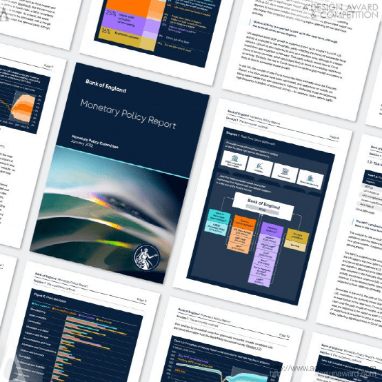
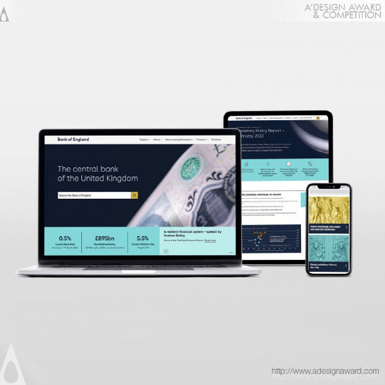
INSPIRATION:
The Bank of England has recently embraced new forms of communicating. Its vision is to be open, inclusive, and straightforward to reach a wider audience. However, it is hard to conjugate staff-led technical outputs and general communications in a manner that the visuals meet the vision consistently. To solve that, the visual identity
has been brought more in line with the Bank's values, purpose, and mission to get closer to the public it serves.
灵感:
英格兰银行最近采用了新的沟通方式。它的愿景是开放、包容、直截了当地接触到更广泛的受众。然而,很难将员工主导的技术输出和一般沟通结合起来,使视觉效果始终符合愿景。为了解决这一问题,银行的视觉标识与银行的价值观、宗旨和使命更加一致,以更接近其服务的公众。
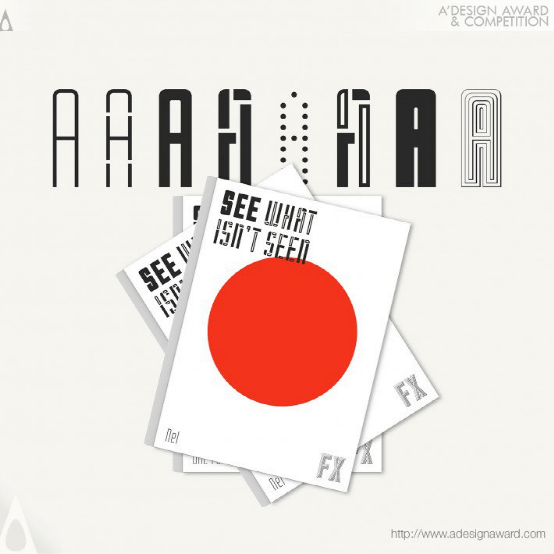
SP Saffron Grotesk Specimen Type Specimen by Paul Robb and Moira Bartoloni
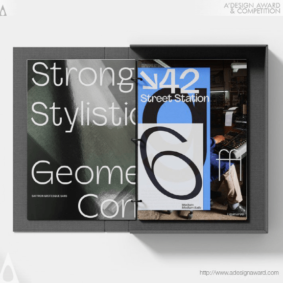
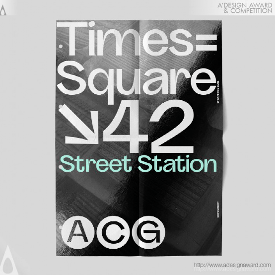
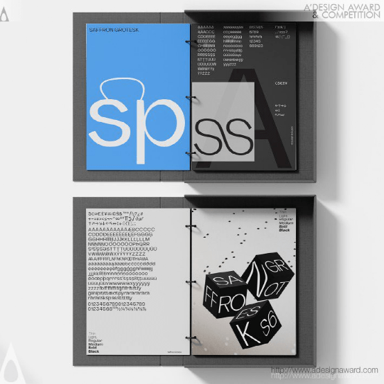
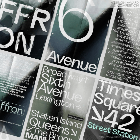
INSPIRATION:
Inspiration for the design of the font was gained from swiss modernist typefaces from 1960 to present aesthetics. The design and form of the folder was inspired by the idea of a reference binder and a manual of usage and to give the idea of a modern digital typeface presented in a retro feel.
灵感:
字体设计的灵感来自1960年至今的瑞士现代主义字体美学。文件夹的设计和形式受到参考活页夹和使用手册的启发,并以复古风格呈现现代数字字体。
Zaku Inc. Corporate Identity byNobuya Hayasaka
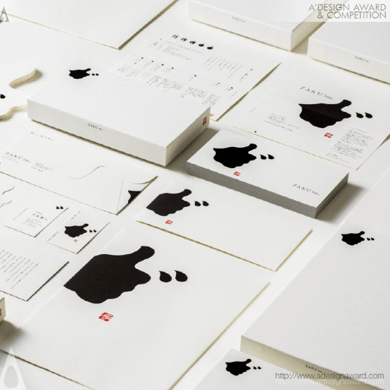
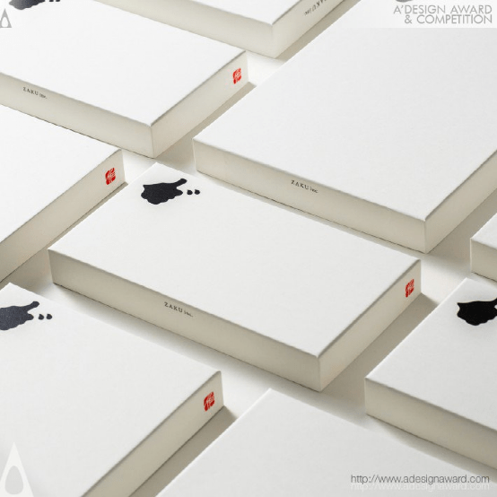
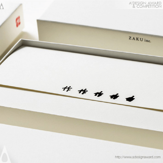
INSPIRATION:
The designer decided to use the client's company slogan itself as the logo design. This company has the slogan "Create good! The symbol of the hand silhouette of "good!" is expressed in the typography of Japanese Kanji characters meaning "to create". And since this kanji can be read as "zaku", it also represents the company name.
灵感:
设计师决定使用客户公司的标语本身作为标志设计。这家公司的口号是“创造美好!象征着手的剪影”美好!“用日文汉字的排版表达,意思是“创造”。由于这个汉字可以读作“zaku”,它也代表了公司名称。
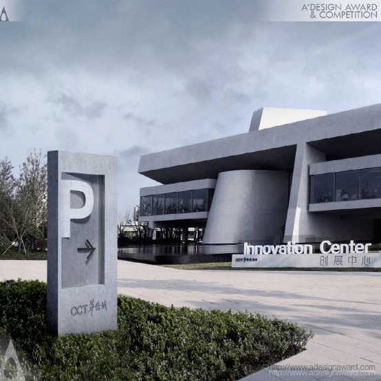
Shenzhen Jiangangshan Hill Park Wayfinding Signage System byupdesign
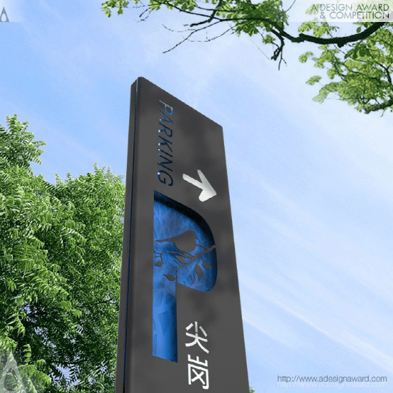
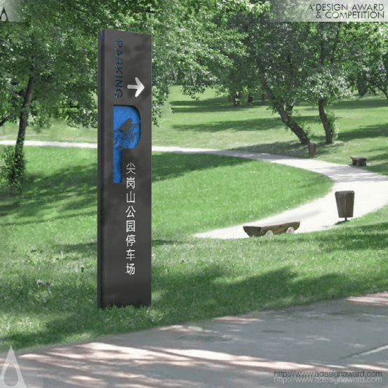
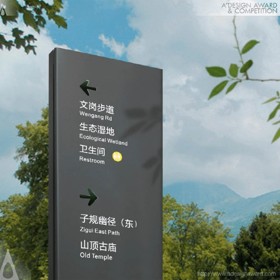
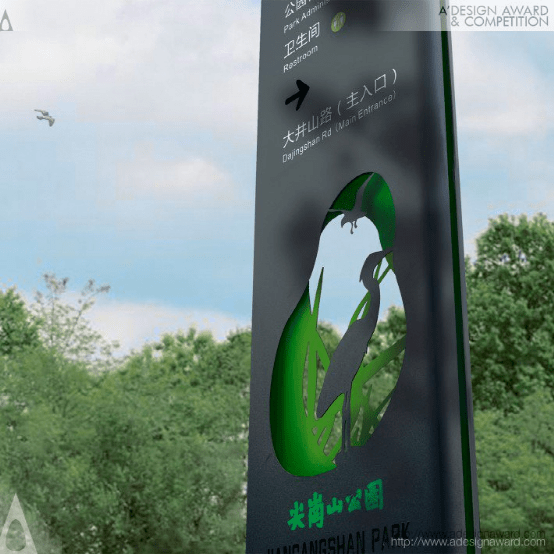

INSPIRATION:
The wayfinding signage system is designed for a wooded hilly municipal park in Shenzhen. It's close to a reservoir, some early high-end residences and school districts. The design is required to preserve the existing ecological experience for most neighboring visitors who are familiar with the ways there. Accordingly, UPD adopts low-contrast colored silhouette art effect to well integrate the whole system into the natural environment in a gentle "hidden" way with basic function of wayfinding.
灵感:
路标系统是为深圳一个树木繁茂的丘陵城市公园设计的。它靠近水库、一些早期高端住宅和学区。该设计要求为大多数熟悉当地道路的周边游客保留现有的生态体验。因此,UPD采用低对比度彩色剪影艺术效果,以温和的“隐藏”方式将整个系统与自然环境完美融合,具有基本的寻路功能。
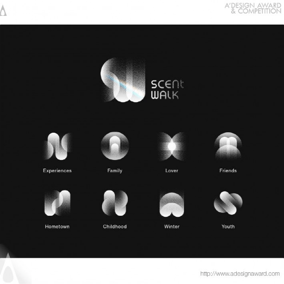
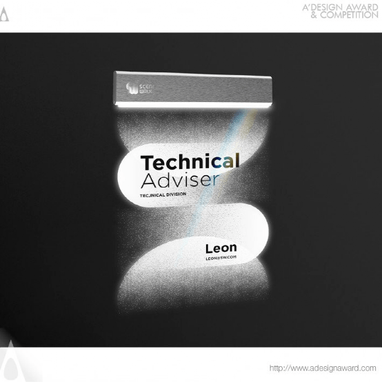
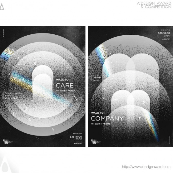
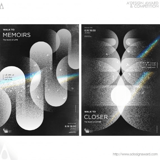
Scentwalk Corporate Identity byChao Yang, Yiyang Li and Yilin Wang
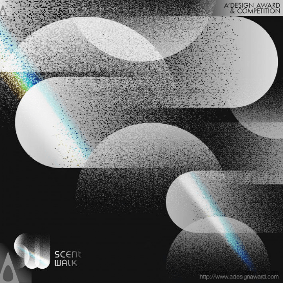
INSPIRATION:
Based on the research, it is found that olfactory memory is more profound and firm than other sensory memory, and can bring rich emotional experience. Some scientific research institutions are trying to extract odor to cure patients with amnesia, and people are trying to use olfactory memory to do some meaningful things. This project is based on the idea of creating a technology company to provide odor extraction services for others in the future, and using odor to cure people.
灵感:
研究发现,嗅觉记忆比其他感官记忆更深刻、更牢固,能带来丰富的情感体验。一些科研机构正试图提取气味来治疗健忘症患者,人们正试图利用嗅觉记忆来做一些有意义的事情。该项目的理念是创建一家技术公司,在未来为其他人提供气味提取服务,并利用气味治疗人。
Bronze A' Design Award Winner for Graphics, Illustration and Visual Communication Design Category in 2021
铜奖得主
The Engravings on Mount Yi Experimental Font Design by Jialiang Jing
INSPIRATION:
Tablet inion calligraphy is an important part of Chinese traditional culture. This project to cobble book "yi Mountain carved stone" as the design language, on the innovative design of traditional culture.The original stone has been lost, its style and artistic status is still epoch-making significance. The purpose of this design is to extract the few in the complex, find the breakthrough way where the spirit is, the tradition can still have a new interpretation.
灵感:
碑刻书法是中国传统文化的重要组成部分。本项目以篆书《峄山刻石》为设计语言,对传统文化进行创新设计。原石已经失传,其风格和艺术地位仍具有划时代的意义。本次设计的目的是提取综合体中的少数元素,找到精神所在的突破之路,对传统仍能有新的诠释。
Half Production Brand Identity by Chin Hock Cong
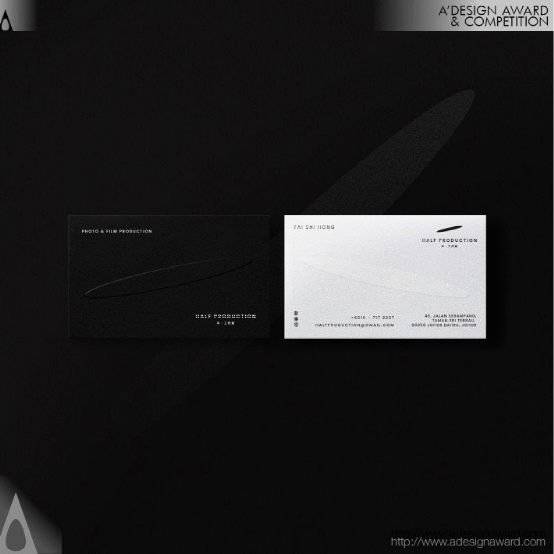
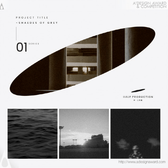
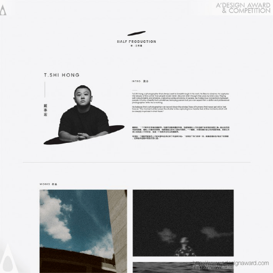
INSPIRATION:
Half Production is a photography and videography studio. The balance between lighting and shadow is something they always seek for. Meanwhile, this also coincides with their philosophy of life. Grasping the balance between half and full is just like being humble and keeping learning, the balance between function and creativity. The logo is inspired by the action of pouring the water.
灵感:
一半的制作是摄影和录像工作室。灯光和阴影之间的平衡是他们一直追求的。同时,这也与他们的人生哲学不谋而合。把握一半和全部之间的平衡就像保持谦虚和学习,功能和创造力之间的平衡。这个标志的灵感来源于倒水的动作。
Lenza Lenzy Clothes Clinic Brand Design by Wallrus Design Studio
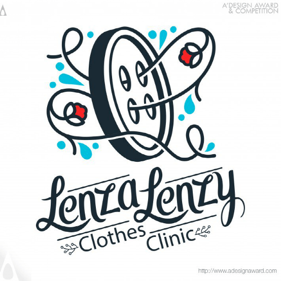
INSPIRATION:
Lenza Lenzy is the first and currently the only clothes clinic in Iran. Lenza Lenzy is committed to provide distinguished services with the highest quality. all garments feel better in Lenza Lenzy clothes clinic. This few sentence where things that drive us to work on this project. Lenza Lenzy is very special because there is not any competitor for it in Iran and there is only three or four clothes clinics exist in around the world. So, we put all of our ability, knowledge and love in this project
灵感:
Lenza Lenzy是伊朗第一家也是目前唯一一家服装诊所。Lenza Lenzy致力于以最高的质量提供卓越的服务。在Lenza Lenzy服装诊所,所有的服装都感觉更好。这几句话是关于推动我们进行这个项目的事情。Lenza Lenzy非常特别,因为它在伊朗没有任何竞争对手,全世界只有三四家服装诊所。所以,我们把我们所有的能力、知识和爱心都投入到这个项目中
BTY Brand Identity logo and Applications by Etude Digital
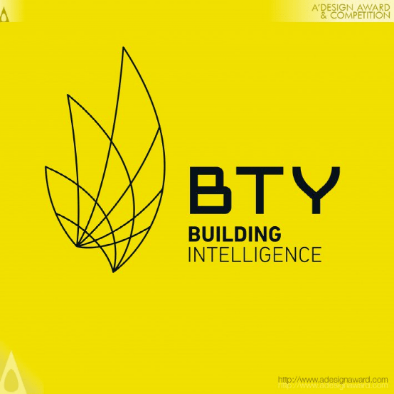

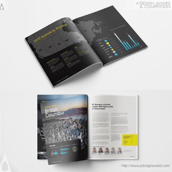
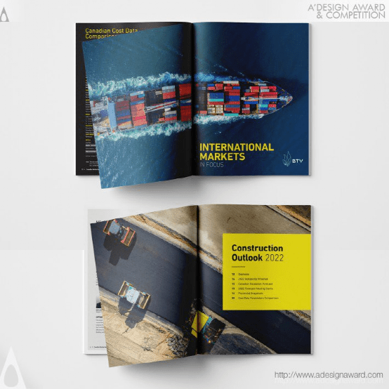
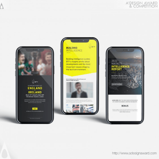
INSPIRATION:
BTY’s new logomark is an analytical & mathematical interpretation of the moment a Gennaker Sail gets deployed. It is also inspired by the disruption that a Gennaker sail brought to the sailboat racing world. This logomark represents the excitement of a more purposeful future, a future of people leading technology, not the other way around.
灵感:
BTY的新标志是对Gennaker风帆部署时刻的分析和数学解释。它还受到了Gennaker帆船给帆船比赛世界带来的破坏的启发。这个标志代表着一个更有目的的未来的兴奋,一个人们引领技术的未来,而不是相反。
Carbon Research Brand Design by Sxdesign
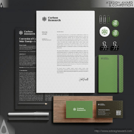
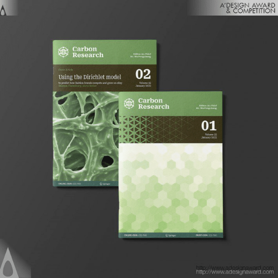
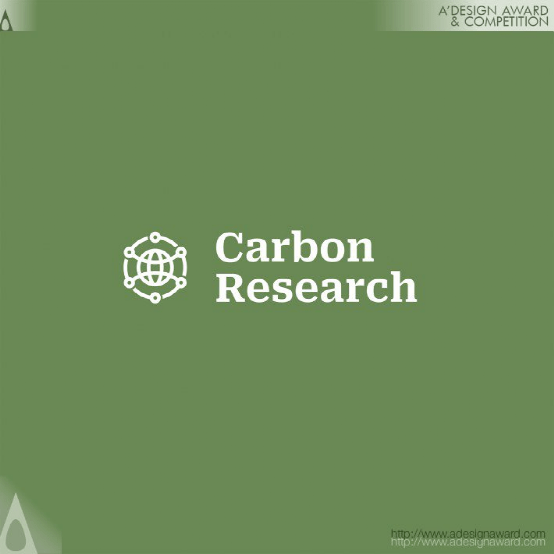
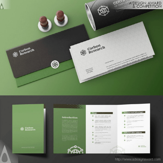
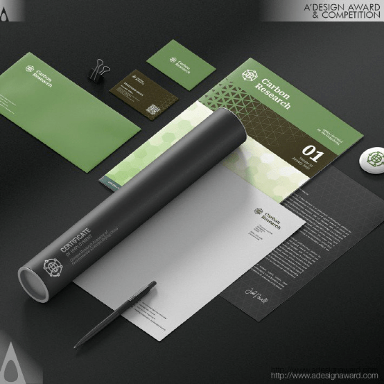
INSPIRATION:
Carbon Research is an academic journal founded in the context of carbon neutrality. It aims to promote the cause of human eco-protection with an international, top-notch and authoritative figure. Based on this position, designers finally chosen the earth, commonly used by international organizations as the core element of the brand identity with the carbon atomic structure.
灵感:
《碳研究》是一本在碳中和背景下创办的学术期刊。旨在以国际化、一流、权威的人物推动人类生态保护事业,基于这一立场,设计师最终选择了国际组织常用的地球作为碳原子结构品牌标识的核心元素。
Brewing Happiness Brand Identity by Gong cha California and Gong cha Global
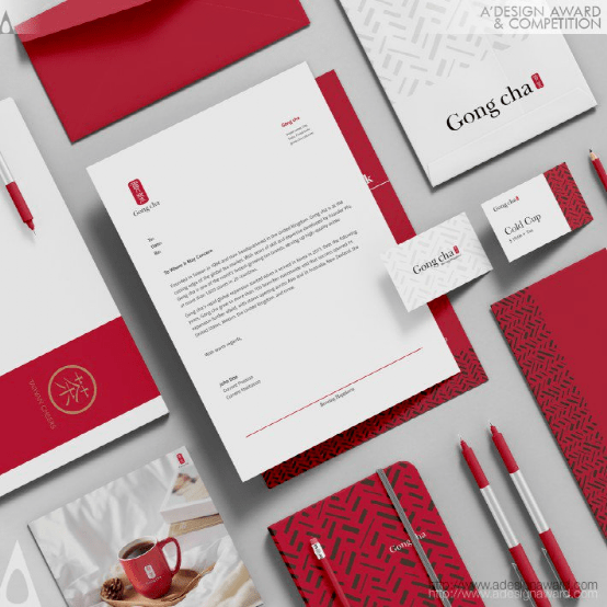
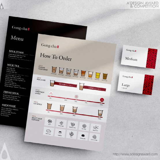
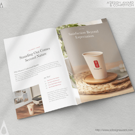
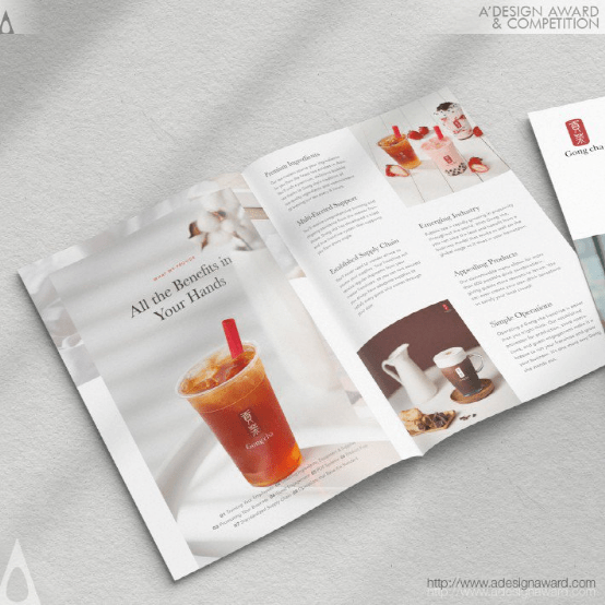
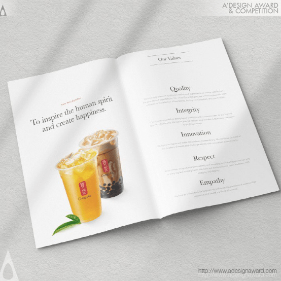
INSPIRATION:
Tea is the flow of time. Tea is a wordless conversation. Tea is a fountain of inspiration, transforming each day into a leisurely journey of taste. Tea is life. It craves contemplation. It's worth savoring. Gong cha always ponders upon how best to brew modest happiness and relaxation in a small cup in your day-to-day life. Gong cha always ponders upon how best to provide a space for a sip of laughter with loved ones. Gong cha always ponders upon how best to share the stories of tea drinking culture easily and enjoyably with many people.
灵感:
茶是时间的流动。茶是一种无言的对话。茶是灵感的源泉,把每一天都变成悠闲的品味之旅。茶就是生命。它渴望沉思。值得一尝。宫茶总是在思考如何在日常生活中用一小杯酒酿造适度的快乐和放松。龚茶总是在思考如何最好地提供一个空间,让爱的人啜饮一口笑声。龚茶一直在思考如何最好地与许多人轻松愉快地分享饮茶文化的故事。
Using Stuff Poster by Juyoung Hwang
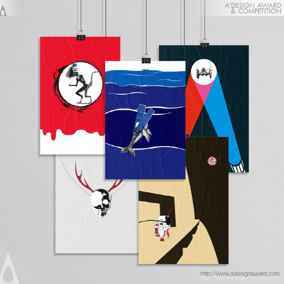
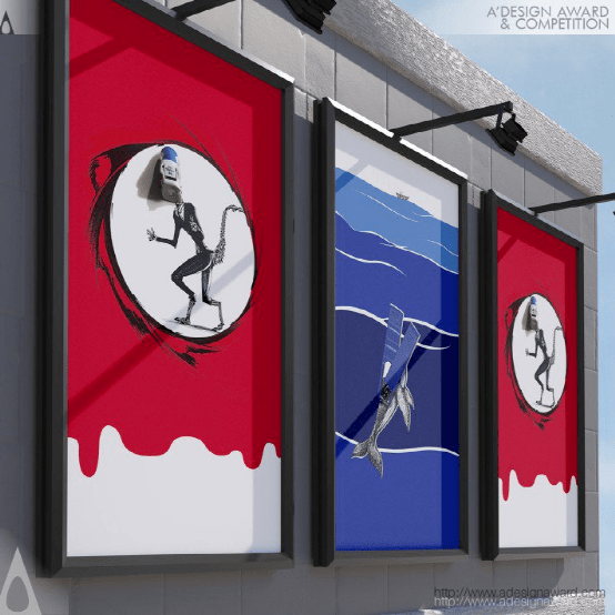
INSPIRATION:
By directly using objects, their size and original functions become accessible. The project creates a situation that contrasts with the characteristics of the object. Through artworks, Juyoung Hwang tries to show different perspectives on the functions of the objects. Then, he finds a way to link the objects with recent social issues, related contents, or others. When the sketch is completed, the final visualization is done so that users can be impressed and understand easily.
灵感:
通过直接使用对象,可以访问对象的大小和原始功能。该项目创建了一种与对象特征形成对比的情况。通过艺术作品,黄俊英试图展示不同的角度对物体的功能。然后,他找到了一种方法,将这些对象与最近的社会问题、相关内容或其他内容联系起来。当草图完成后,最终的可视化工作就完成了,这样用户就可以很容易地印象深刻和理解。
Cafe Soul Visual Identity and Brand Design byMateus Matos Montenegro
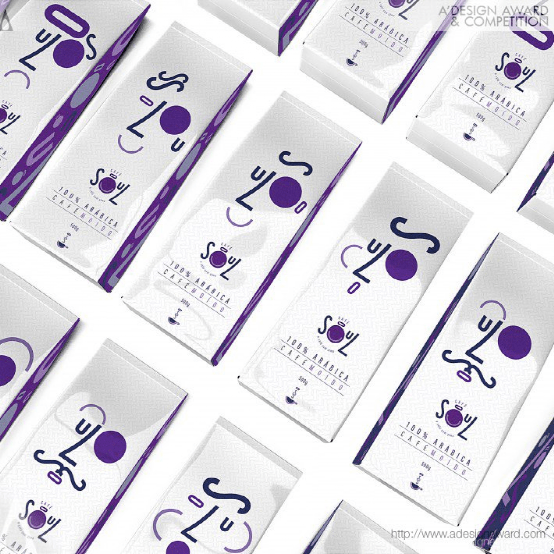
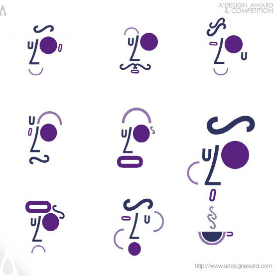
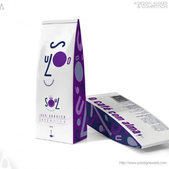
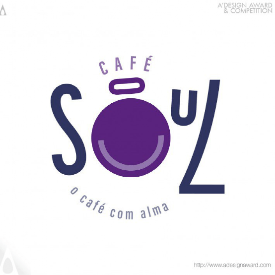
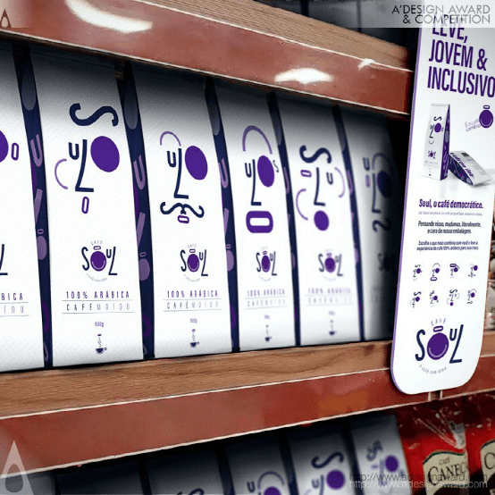
INSPIRATION:
Soul coffee was created aiming a lighter, younger and more inclusive language. The concept is based on carpe diem, living well, living in harmony and, at the same time, not taking life too seriously. It makes us feel good in every way, from the smells to the tasting, feeling the flavor and being enveloped by its properties, a unique and FUN experience of well-being after having a cup. A democratic quality coffee. Soul is in the essence of each one. It is at the heart of pluralism and diversity. Soul is in the essence of coffee, IT IS COFFEE WITH SOUL.
灵感:
灵魂咖啡旨在创造一种更轻、更年轻、更包容的语言。这个概念是基于及时行乐,生活得好,生活得和谐,同时,不太重视生活。它让我们在各个方面都感觉很好,从气味到品尝,感受到味道,被它的特性所包围,这是一种独特而有趣的喝完一杯后的幸福体验。一种民主品质的咖啡。灵魂是每个人的本质。它是多元化和多样性的核心。灵魂是咖啡的本质,它是有灵魂的咖啡。
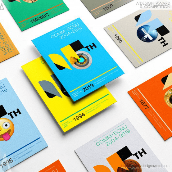
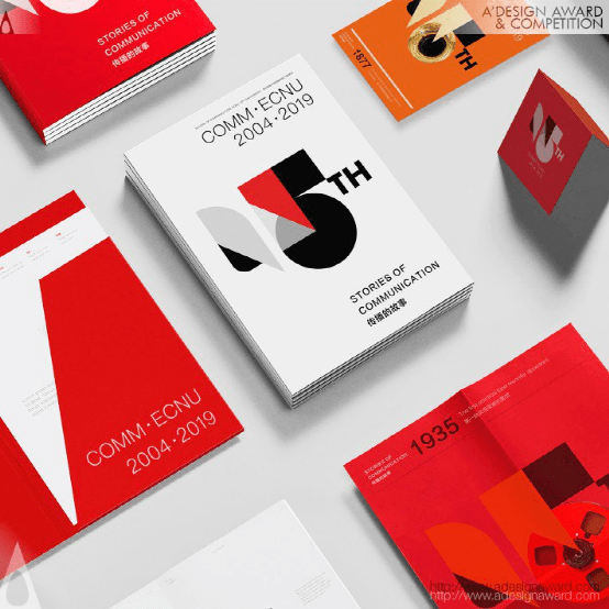
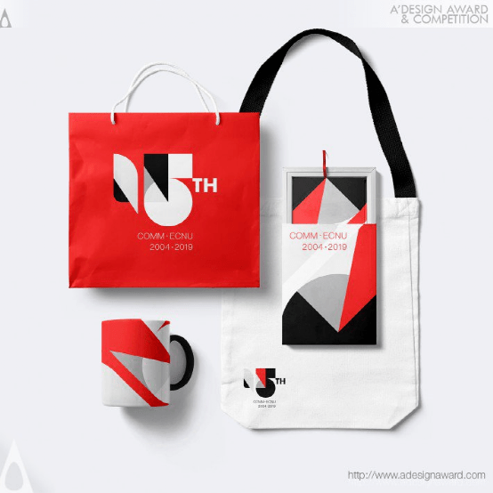
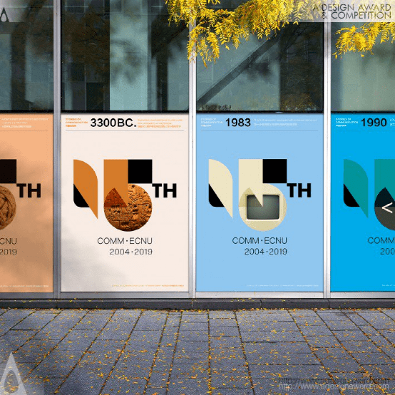
Stories of Communication Branding byMengyi Xie
INSPIRATION:
The inspiration of the project was from stories in the history of Communication, from Quipu- Knotted strings for information collection in prehistoric civilization to the first newspaper in the 17th century, and until the www (world wide web). The idea of design was to fuse these stories into visual identity system for the 15th anniversary of the School of Communication, memorizing the contribution of communication discipline and building up the brand image of school.
灵感:
该项目的灵感来源于传播史上的故事,从史前文明中收集信息的Quipu-Knotted strings到17世纪的第一份报纸,直到万维网(www)。设计理念是将这些故事融入视觉识别系统,纪念传播学院成立15周年,纪念传播学科的贡献,树立学校的品牌形象。
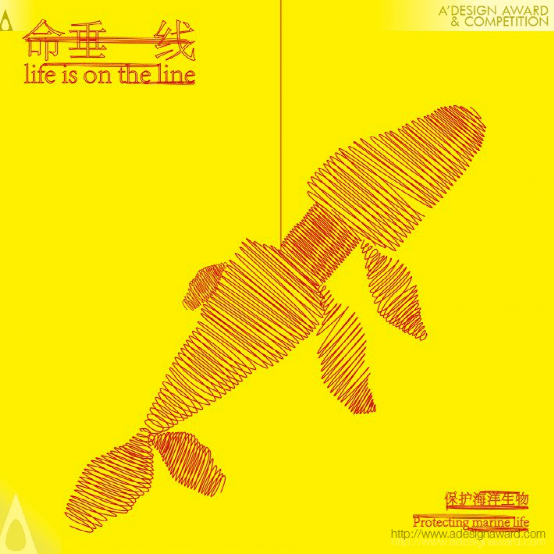
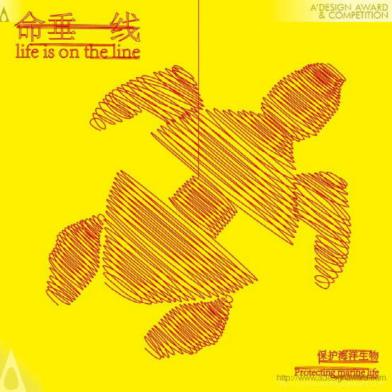
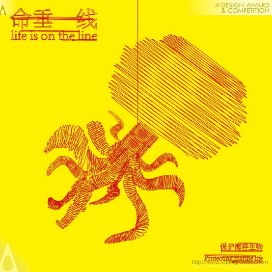
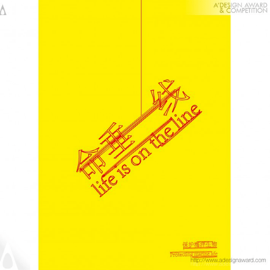
Precious Lives Illustration by Yunjia Yang
INSPIRATION:
The theme of this poster set is the protection of marine life. The author uses a thin red rope to outline the forms of marine creatures: sea turtles, jellyfish and whales. It shows that these creatures are bound by the garbage environment and reflects the critical situation of marine life. The whole poster also uses a combination of high-level drawing skills and high-tech software to convey the idea of protecting marine life to the public through various media.
灵感:
这套海报的主题是保护海洋生物。作者用一根细细的红色绳子勾勒出海洋生物的形态:海龟、水母和鲸鱼。这表明这些生物受到垃圾环境的束缚,反映了海洋生物的危急状况。整张海报还结合了高水平的绘画技巧和高科技软件,通过各种媒体向公众传达保护海洋生物的理念。
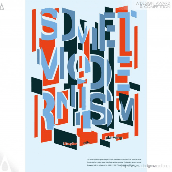
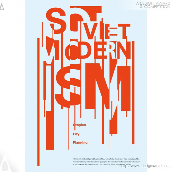
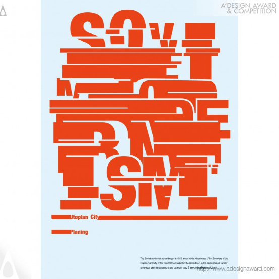
Utopian City Poster by QiuYu Li
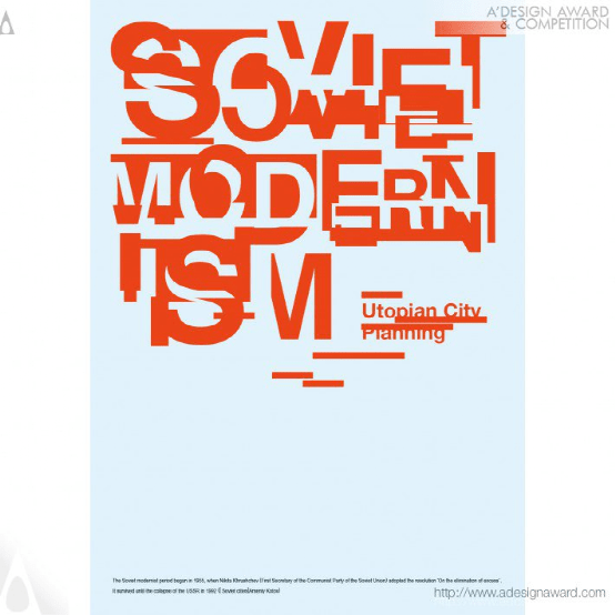
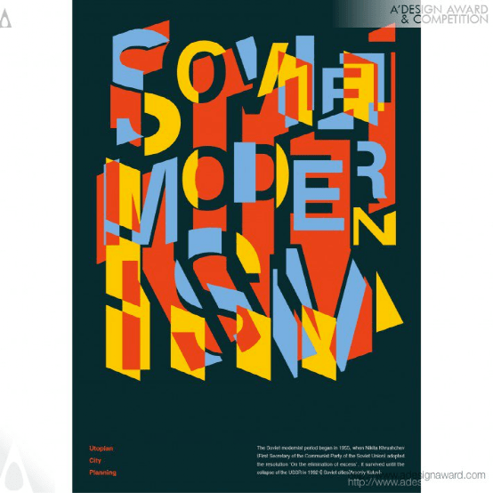
INSPIRATION:
Soviet Modernist architecture is steadily disappearing with the dismantling of the Soviet Union. Aside from politics, it has a meaning to be recorded as a symbol of an era. while this poster is a visual experiment, it also aims to record the culture of an era. Rethink the past for the future and discover some new possibilities.
灵感:
随着苏联解体,苏联现代主义建筑正在稳步消失。除了政治,它还有被记录为一个时代的象征的意义。虽然这张海报是一个视觉实验,但它也旨在记录一个时代的文化。为未来反思过去,发现一些新的可能性。
Ronin Silkscreen Print by Dmitry Kudinov
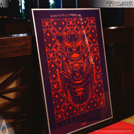
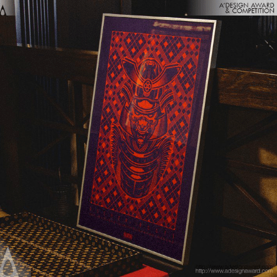
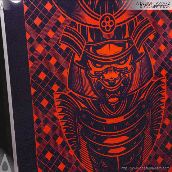
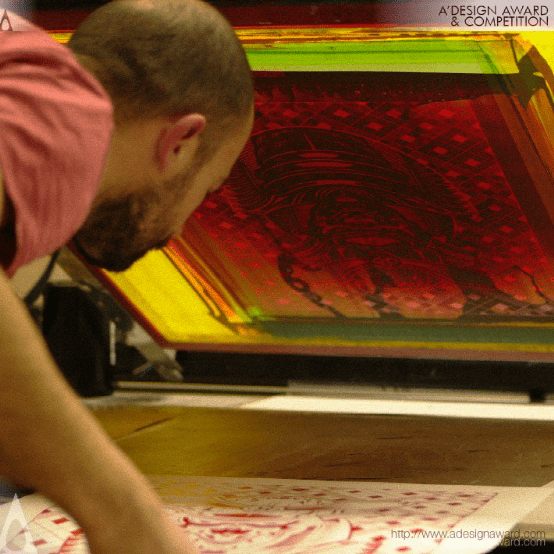
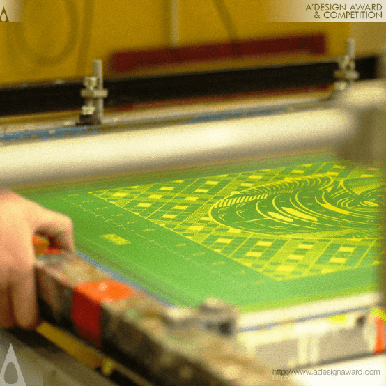
INSPIRATION:
Deeper Roots Stronger Branches - author's slogan, life credo, which reflects the approach to the creative path as a whole. The realization of any task requires immersion in a previously unknown
field of activity and a deeper immersion in the subject creates more opportunities for development.
灵感:
更深的根更强大的分支――作者的口号,生活信条,它反映了整个创作道路的方法。任何任务的实现都需要沉浸在一个以前未知的活动领域中,对该主题的深入沉浸会创造更多的发展机会。
365 Days Taiwanese Foods Calendar by Hsiao Ting Tang and Goyen Chen
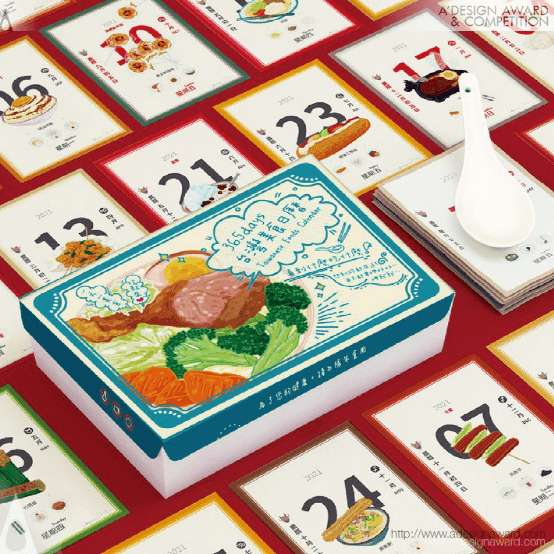
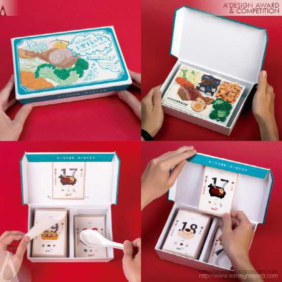
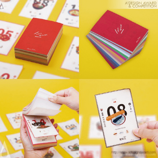
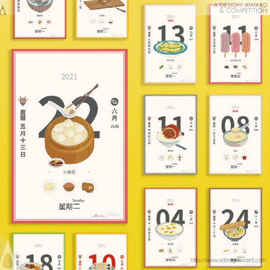

INSPIRATION:
Through Taiwanese cuisine, this team has drawn and accumulated hundreds of illustrations. For the sake of commercialization, a calendar dedicated to Taiwanese food was created by specifically combining the "Bento box", a local lunch box packaging unique to Taiwan, with a Taiwanese calendar. As a result, a lot of research on local food was also done, and the inspiration for the illustration content was found through the collection process.
灵感:
通过台湾美食,这个团队绘制并积累了数百幅插图。为了实现商业化,专门为台湾食物制作了一个日历,将台湾特有的当地午餐盒包装“便当盒”与台湾日历结合起来。因此,人们也对当地食物进行了大量研究,并通过收集过程找到了插图内容的灵感。
Hocan Healthy Corporate Identity by Guangzhou Cheung Ying Design Co. Ltd.
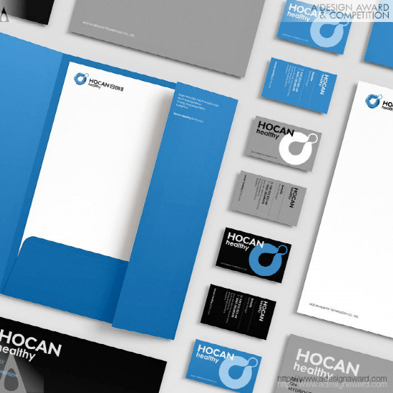
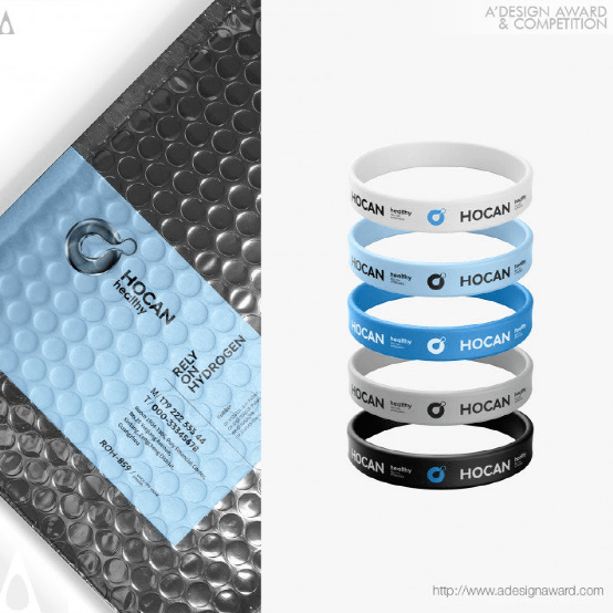
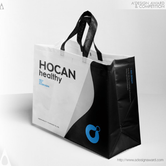
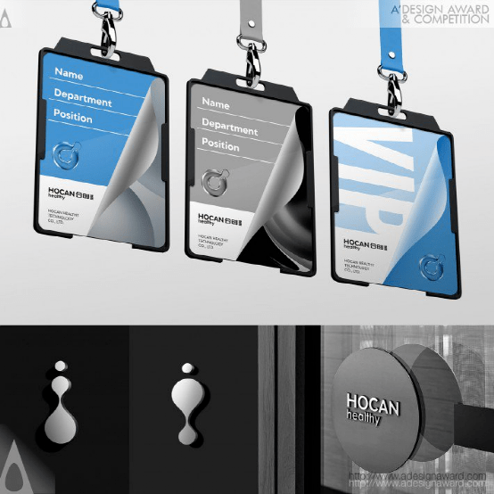
INSPIRATION:
Hocan healthy mainly develops intelligent technology products around 'hydrogen drinking water, hydrogen breathing and hydrogen health care'. In the design of the logo, we summarized the 'hydrogen molecule' into a more focused circle, showing the change process between water and hydrogen in the form of positive and negative shapes, and skillfully expressing the industrial features of the brand. Boldly use technology blue as the main color, and cooperate with three-dimensional modeling to make it significantly different from similar brands and increase consumer attention.
灵感:
Hocan health主要围绕“氢饮用水、氢呼吸和氢保健”开发智能技术产品。在logo的设计中,我们将“氢分子”总结成一个更为集中的圆圈,以正反两种形状展示了水和氢之间的变化过程,并巧妙地表达了品牌的行业特征。大胆采用科技蓝为主色,配合立体造型,使其与同类品牌有明显区别,增加消费者关注度。
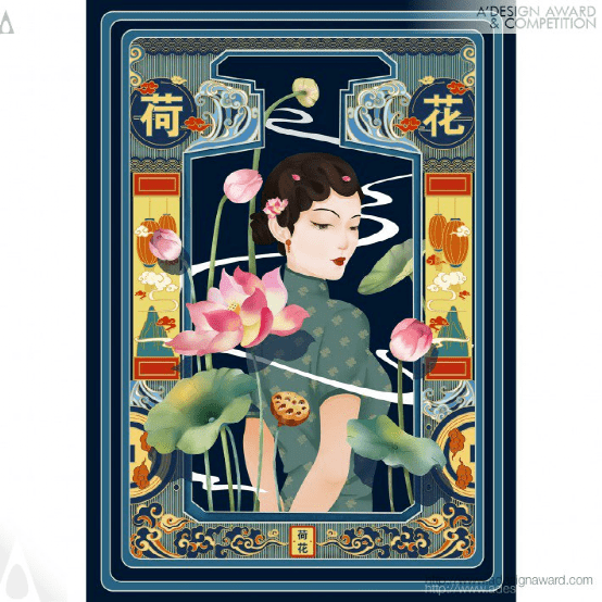
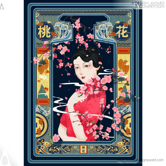
Chinese Festivals Illustration by Chunli Zhou
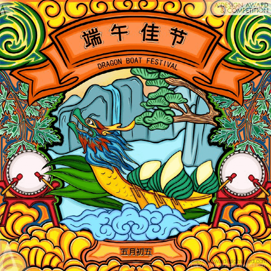
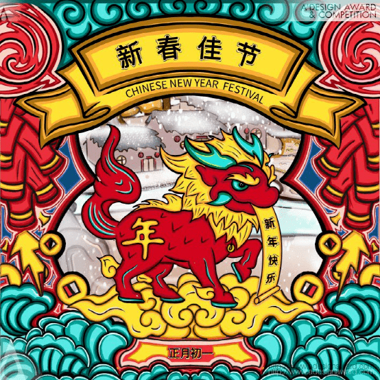
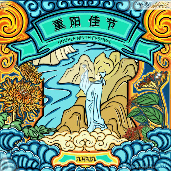
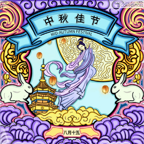
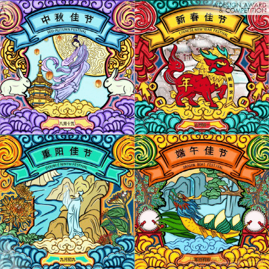
INSPIRATION:
The inspiration for the illustration design comes from traditional Chinese festivals. The strong atmosphere of festivals often makes people feel happy and joyful, and it is the responsibility and duty of every citizen to pass on the culture. Therefore, through illustration design, I hope to realise the effective innovation of traditional festival elements in contemporary times, spreading the energy of Chinese traditional festivals while making more people fall in love with Chinese festivals.
灵感:
插图设计的灵感来自中国传统节日。节日的浓厚氛围往往让人感到快乐和喜悦,传承文化是每个公民的责任和义务。因此,我希望通过插图设计,实现传统节日元素在当代的有效创新,传播中国传统节日的能量,同时让更多的人爱上中国节日。
Naturally Fluid Brand Design by Centrick
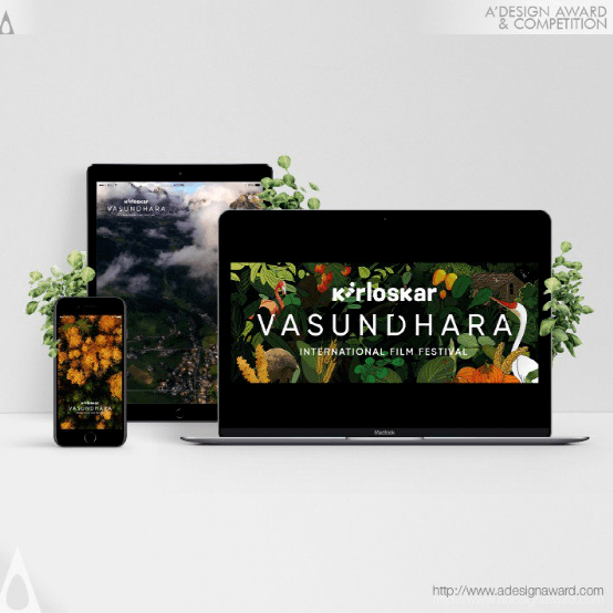
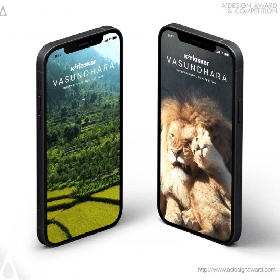
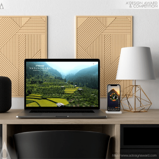
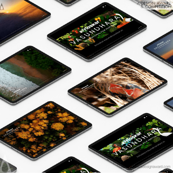
INSPIRATION:
For a film festival about nature, nature formed the inspiration for the visual language and the tone of voice. The style of illustrations reflected the rawness of nature and its imperfect beauty. The films used Mother Nature as the voice to communicate with the audience and get them to watch the Kirloskar Vasundhara International Film Festival.
灵感:
对于一个关于自然的电影节来说,自然形成了视觉语言和语调的灵感。插图的风格反映了大自然的原始和不完美的美。这些电影以大自然为声音与观众交流,让他们观看基洛斯卡・瓦松达拉国际电影节。
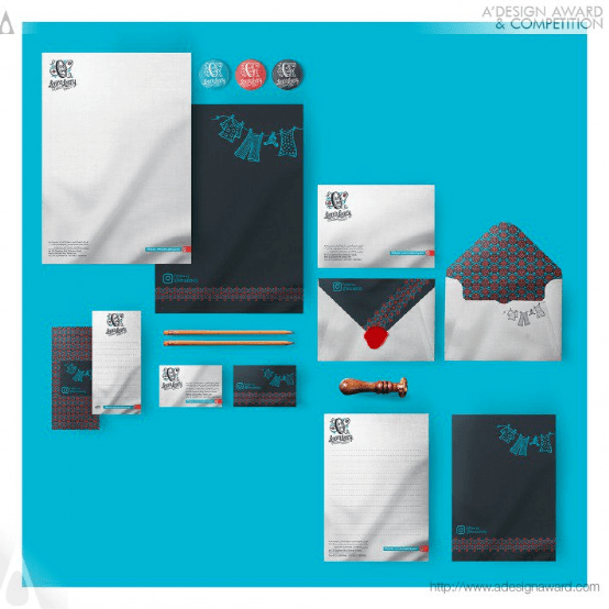
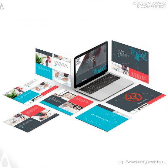
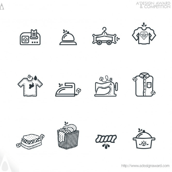
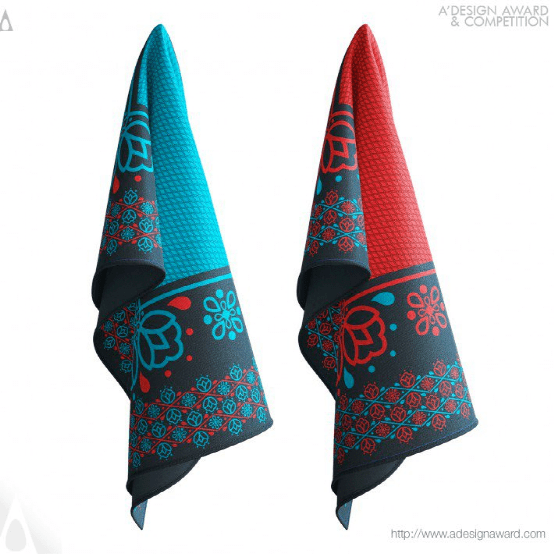
Jing Yin Li Brand Design by Sxdesign
INSPIRATION:
For the visual identity of a new clothes cleaning and care brand at Chinese market, focused on providing healthy and slightly luxury lifestyle, comes to a name Jing Yin Li, which means pure gravitation or the power to the cleanness in English. As a new brand, its logo need to be eye-catching, along with sense of reliability and firmness. Designer tried to establish the whole graphic with simple geometric shapes like circles and squares, in order to make it easy for consumers to recognize and to remember. Those shapes also form three particular letters, which refers to the abbreviation of brand name Jing Yin Li.
灵感:
在中国市场上,一个新的服装清洁和护理品牌专注于提供健康而略显奢华的生活方式,其视觉标识被命名为“京印力”,在英语中,这意味着纯粹的引力或清洁的力量。作为一个新品牌,它的标志需要引人注目,同时还要有可靠性和坚定性。设计师试图用简单的几何图形(如圆形和正方形)来创建整个图形,以便于消费者识别和记忆。这些形状也形成了三个特殊的字母,这是品牌名称京银里的缩写。
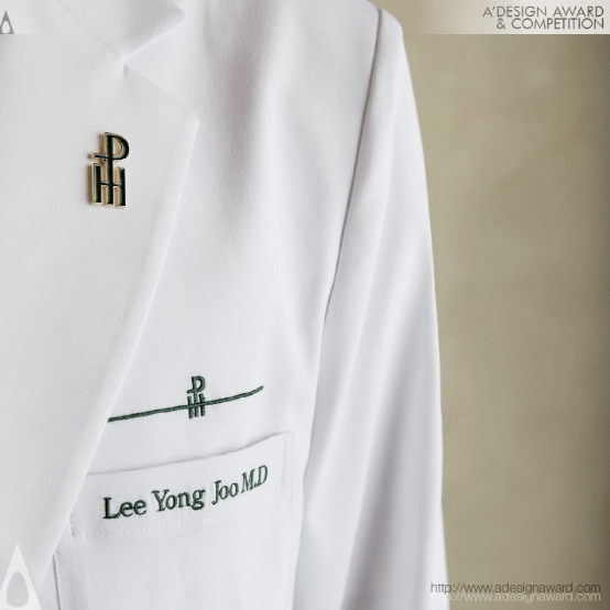
Pentaheal Clinic Rebranding Brand Identity by Pentaheal and Eidetic
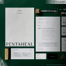
INSPIRATION:
The biggest motif of Pentaheal Clinic design is 'extension';. Functional medicine, a field that is not yet well known in Korea, is expressed as a medical symbol "cross(+), an easy and simple visual language so that it can be recognized by global patients. It was balanced as branding in combination with 'P' and 'H', which are the abbreviations of the hospital.
灵感:
Pentaheal诊所设计的最大主题是“扩展”;。功能医学是一个在韩国尚不为人所知的领域,它以医学符号“cross(+)”来表达,这是一种简单易懂的视觉语言,因此可以被全球患者识别。它与医院的缩写“P”和“H”相结合,形成了品牌平衡。
Avant Modern Cuisine Brand Identity by Jiawei Wu
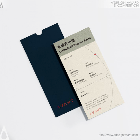
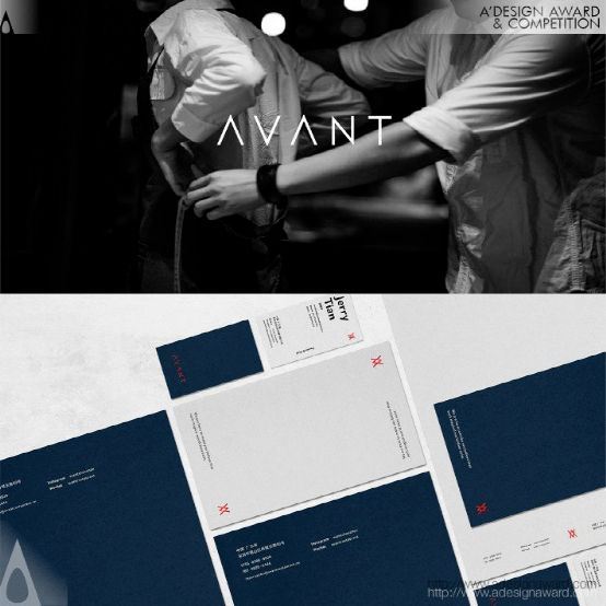
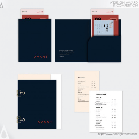
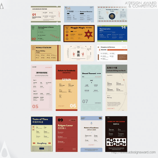
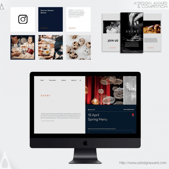
INSPIRATION:
The owners of the Avant are two young Chinese chefs who had the global experience of studying and living in different countries. The restaurant combines techniques from various regions of the world with local ingredients and traditional Chinese cuisine. From the moment they step into Avant to their departure, customers are immersed in a delightful journey through the modern and elegant branding identity modeled after the owners' journeys.
灵感:
先锋餐厅的老板是两位年轻的中国厨师,他们在世界各地都有在不同国家学习和生活的经验。这家餐厅将来自世界各地的技术与当地食材和传统中餐相结合。从走进前卫到离开,顾客们都沉浸在一段愉快的旅程中,通过模仿车主旅程的现代而优雅的品牌标识。
Viskit Reading and Study Supplies by Jaehun Kim
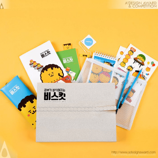
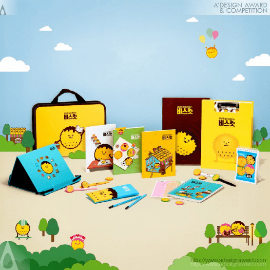
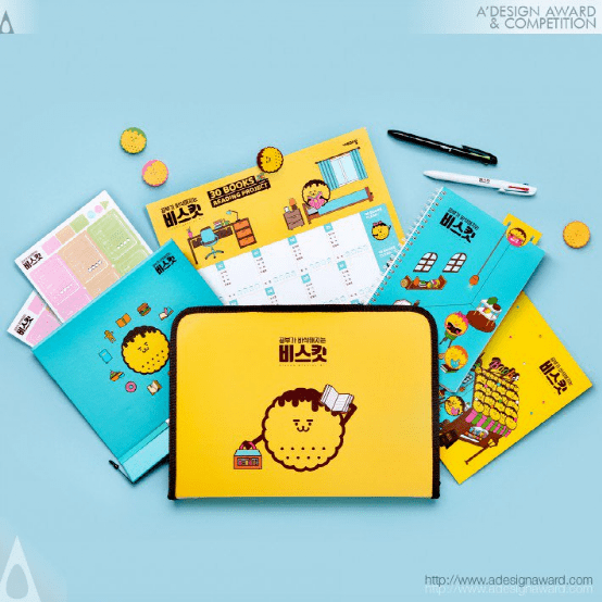
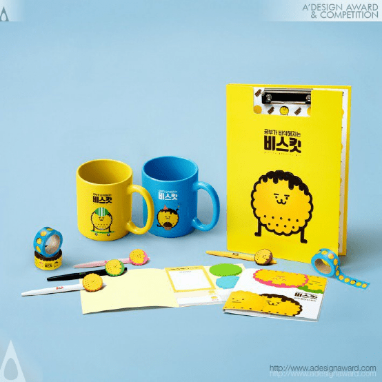
INSPIRATION:
The brand name “ViSKit,” derived from “Visang Special Kit,” is a Korean wordplay, sharing pronunciation with the word ‘biscuit.’ The product characters were designed as biscuits to give a real ‘crunch’ to students’ learning, just like that of a biscuit. The chocolate, strawberry, green-tea, and cheeses biscuit characters engagingly represent daily life. ViSKit seeks to bring a familiar and friendly approach to students through its biscuit characters and products that enrich school life.
灵感:
品牌名“ViSKit”源于“Visang Special Kit”,是一种韩语文字游戏,与“饼干”一词发音相同产品角色被设计成饼干,给学生的学习带来真正的“嘎吱嘎吱”声,就像饼干一样。巧克力、草莓、绿茶和奶酪饼干的特征令人着迷地代表着日常生活。ViSKit试图通过饼干的特点和丰富学校生活的产品,为学生们带来一种熟悉和友好的方式。
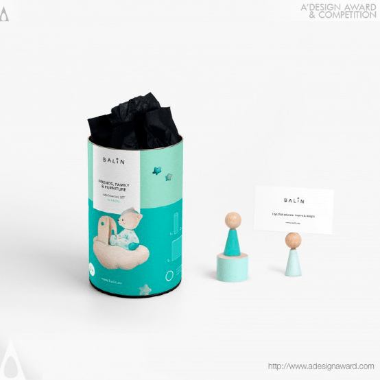
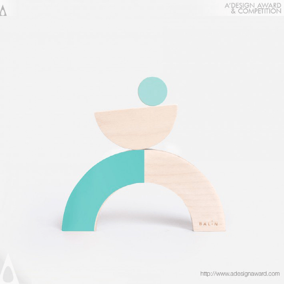
Joy of Playing Brand Identity bySQUARED
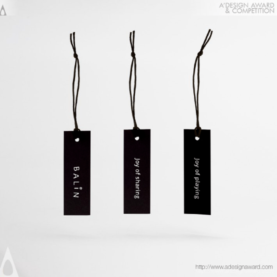
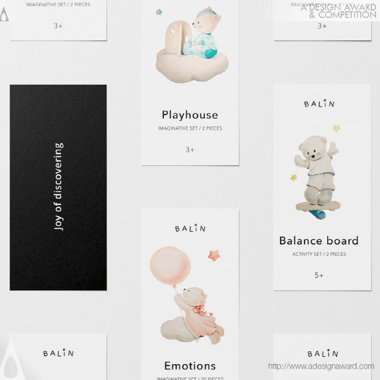
INSPIRATION:
Balin is a brand with purpose. Their aim is to promote healthy active play, develop social and emotional skills and foster knowledge about the environment through fun and engaging play experience. They needed an identity, look and feel coherent with their brand purpose, values and beliefs. That is why we developed an authentic, positive and fun visual language based on minimalistic aesthetics and topped with heartmelting aquarelle illustrations.
灵感:
巴林是一个有目的的品牌。他们的目标是促进健康的积极游戏,发展社交和情感技能,并通过有趣和引人入胜的游戏体验培养有关环境的知识。他们需要一个与他们的品牌宗旨、价值观和信念相一致的身份、外观和感觉。这就是为什么我们在极简主义美学的基础上开发了一种真实、积极、有趣的视觉语言,并以令人心旷神怡的水彩画插图为基础。
Open Air Corporate Identity by Ana Fatia and Sofia Silva
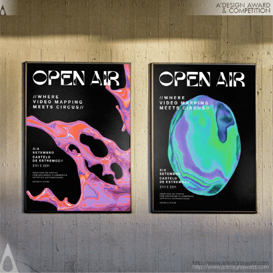
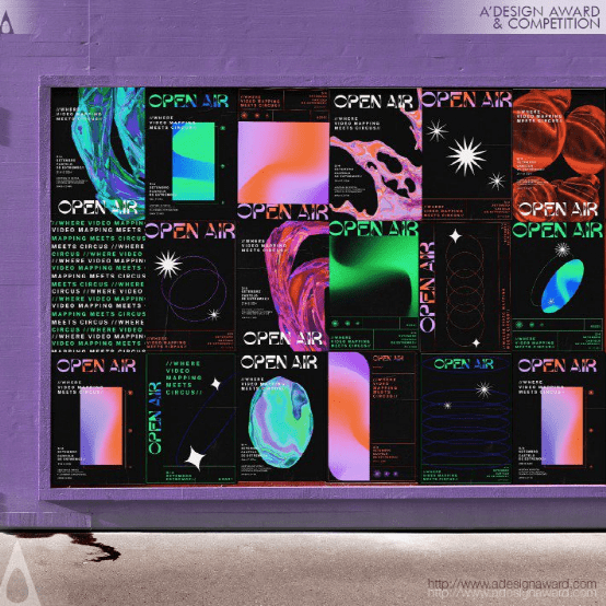
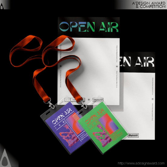
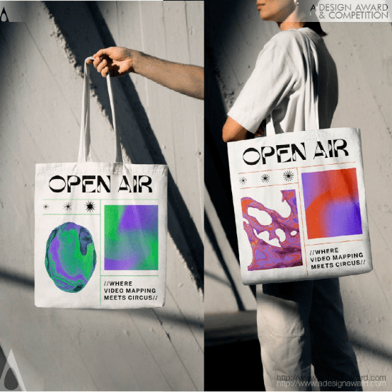
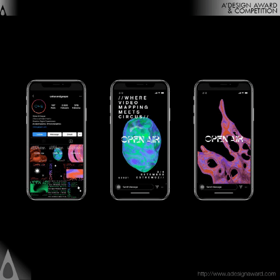
INSPIRATION:
With the world closing down, we needed to find solutions that go against the absence of creation and sharing with others. It is in the context of this reflection that together we decided that since we were all left in a standstill and fluctuating in time the best would actually be to go for an experience where everyone would be (metaphorical way) suspense in the air, in time, in fantasy and floating in the air. We found ourselves to redesign hope through action.
灵感:
随着世界的关闭,我们需要找到与缺乏创造和与他人分享相反的解决方案。正是在这种反思的背景下,我们一起决定,既然我们都处于静止状态,时间在波动,最好的做法实际上是去体验一种每个人都(以隐喻的方式)悬念在空气中,在时间里,在幻想中,在空气中漂浮的体验。我们发现自己要通过行动重新设计希望。
Transam Carriers Brand Identity by Maksim Zinchuk
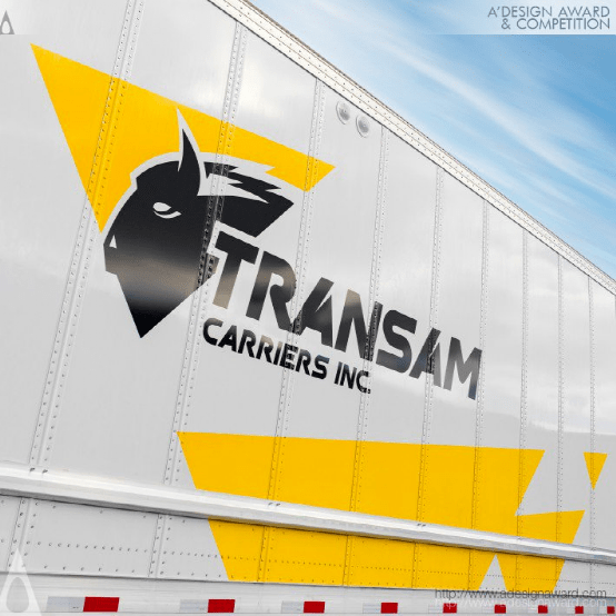
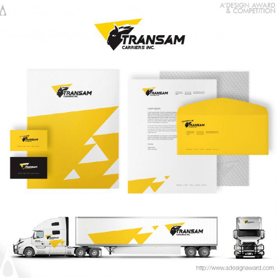
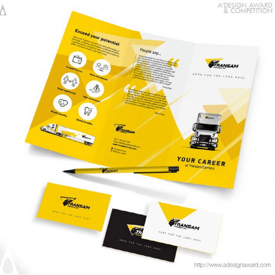
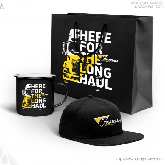

INSPIRATION:
The roots of the brand grow from Eastern Europe where the rare animal Zubr, or European Bison, is the biggest animal, symbolizes uniqueness and power. It has a very similar look to American Bison. For Native Americans, the Bison was also quite sacred and respected. Transam Carriers began using the Bison image starting from the second logo version to convey the spirit of its brand.
灵感:
该品牌起源于东欧,那里的珍稀动物Zubr或欧洲野牛是最大的动物,象征着独特性和力量。它的外形与美国野牛非常相似。对于美洲原住民来说,野牛也是非常神圣和受人尊敬的。Transam Carriers从第二个徽标版本开始使用Bison图像来传达其品牌精神。
Integration Disaster Prevention Pictogram by Noriaki Mori
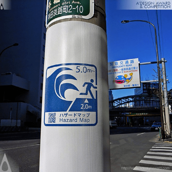
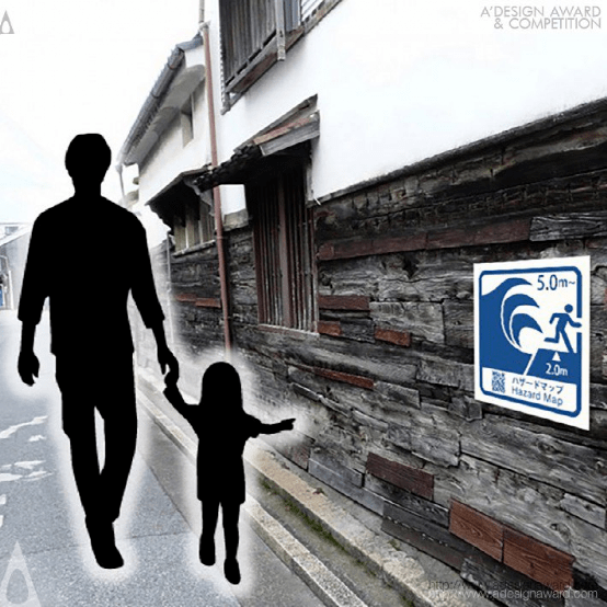
INSPIRATION:
Japan has experienced many tsunami damages caused by the earthquake. However, the official arrival wave height and hazard map for the tsunami in the area have not been prepared. In addition, the display that evokes the tsunami is not unified by local governments.This is a universal reality. We developed this integrated pictogram to return to the world where it is common for information needed in an emergency to be clear on a daily basis.
灵感:
日本经历了多次地震造成的海啸破坏。然而,该地区海啸的官方到达波高和危险地图尚未准备好。此外,引发海啸的展览并没有得到地方政府的统一。这是一个普遍的现实。我们开发这个综合象形图是为了回到世界,在这个世界上,紧急情况下需要的信息每天都清晰可见。
Little Fairy Illustration by Tingting Jing
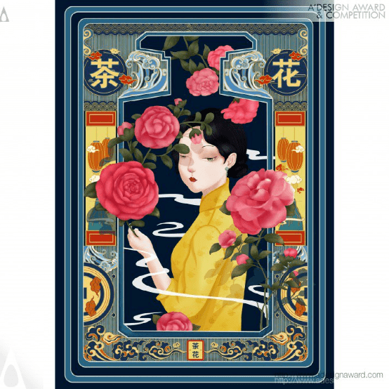
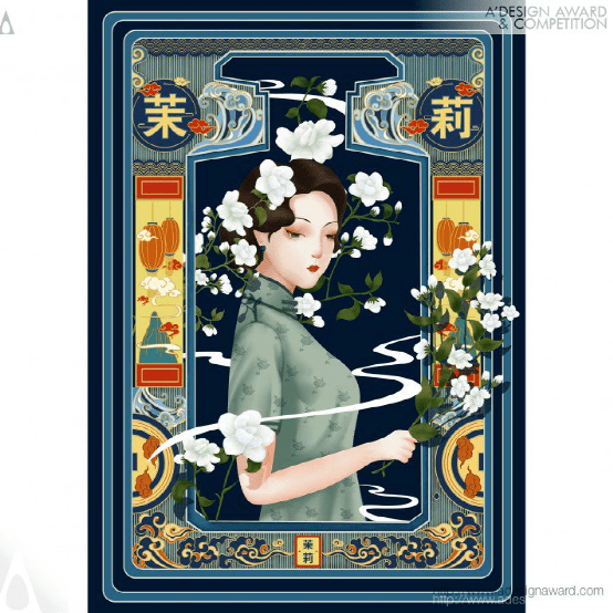
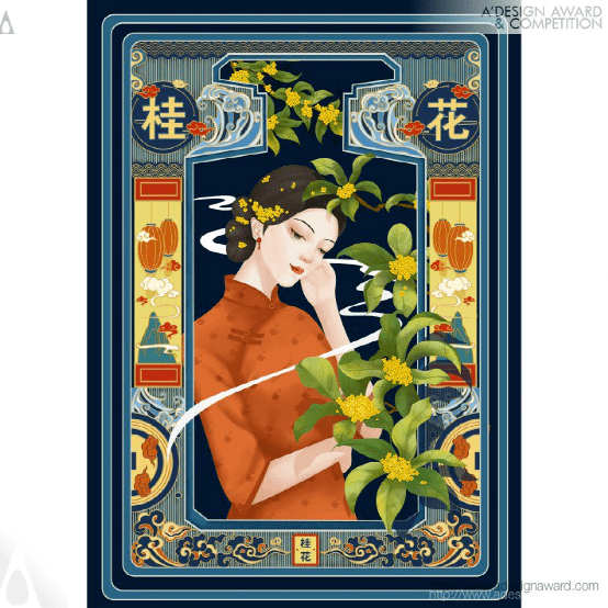
INSPIRATION:
Inspiration comes from the combination of traditional culture and modern design. In today's rapidly developing era, traditional culture should also be updated. Based on the association of different tonality of flowers, and then design their anthropomorphic images, the picture can make more people know and be familiar with the beauty of Traditional Chinese culture
灵感:
灵感来自传统文化与现代设计的结合。在当今飞速发展的时代,传统文化也应该更新。通过对花卉不同色调的联想,进而设计其拟人形象,使更多的人了解和熟悉中国传统文化之美
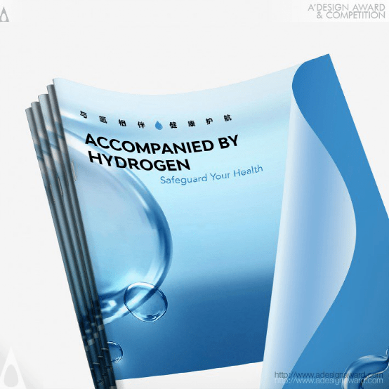
Rely on Hydrogen Corporate Identity by Guangzhou Cheung Ying Design Co. Ltd.
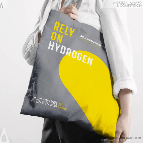
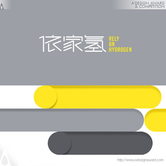
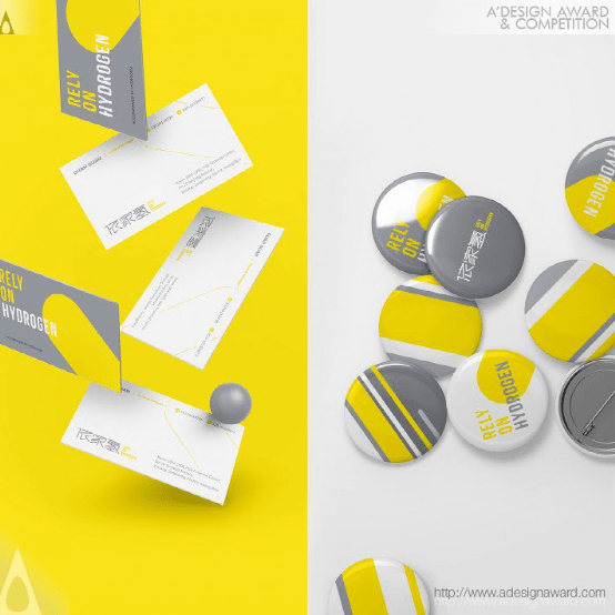
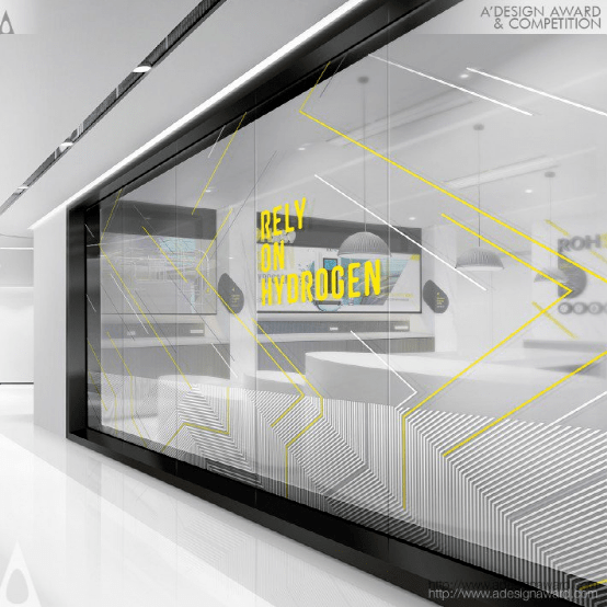
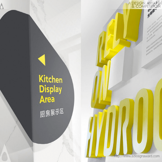
INSPIRATION:
Rely On Hydrogen is a high-tech enterprise focused on the field of biotechnology and aim at the R&D of hydrogen water health care products. After sufficient research, the brand logo is designed in the form of Chinese characters, inspired by the circuit lines of the product and the traditional Chinese water hexagram graphics. In the creative execution, the commonality of 'lines' between each other is extracted and visually integrated to create a visual system with brand attributes and personality.
灵感:
Relay On Hydrogen是一家专注于生物技术领域的高科技企业,旨在研发氢水保健产品。经过充分研究,品牌标识以汉字形式设计,灵感来自产品的电路线和传统的中国水卦图形。在创意执行中,相互之间的“线”的共性被提取出来,并在视觉上进行整合,以创建一个具有品牌属性和个性的视觉系统。
Auspicious Beast Patterns byGuangzhou Kemei Commodity Co., Ltd.
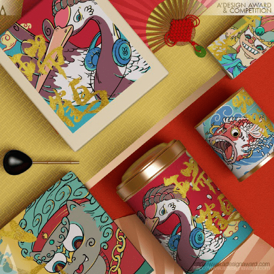
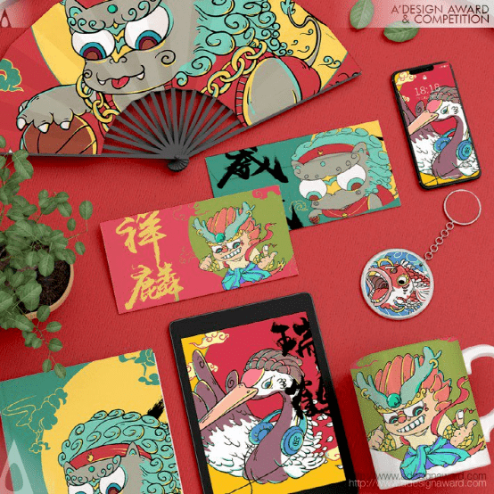
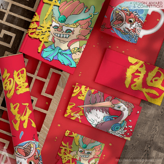
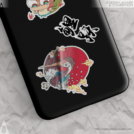
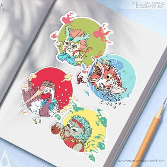
INSPIRATION:
The graphics of this series come from auspicious beasts that have been passed down from ancient times to the present in China, such as carp, crane, lion and kylin, representing fortune, longevity, safety and auspiciousness respectively. By virtue of this, the brand hopes to send positive and wonderful wishes to users and encourage them to stay optimistic in the Covid-19 Pandemic.
灵感:
这一系列的图案来自中国自古以来流传至今的吉祥动物,如鲤鱼、鹤、狮子和麒麟,分别代表幸运、长寿、安全和吉祥。凭借这一点,该品牌希望向用户发送积极而美好的祝愿,并鼓励他们在新冠肺炎大流行中保持乐观。
Art Stroyka Fest Identity of Family Festival by Tanya Dunaeva
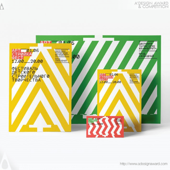
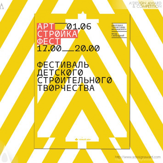
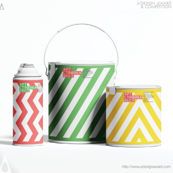
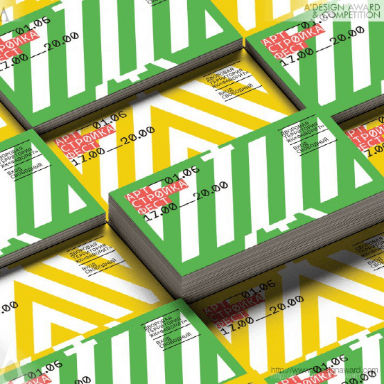
INSPIRATION:
The typographic solution is designed in a strict and slightly dry style, reminiscent of signatures on architectural blueprints, which are always more important than the underlaying image. The strictness of the design of the festival, was consciously made as close to the real appearance of the construction site as possible. It is emphasising the idea that there is always a place for creativity even in such serious professions as construction.
灵感:
排版方案的设计风格严格,略显干涩,让人想起建筑蓝图上的签名,这些签名总是比底图更重要。节日设计的严格性,有意识地尽可能接近建筑工地的真实外观。它强调了一个观点,即即使在建筑业这样严肃的职业中,创造力也总是有一席之地的。
Part Timers Dignity Graphics Design byJung Beom Park
INSPIRATION:
After the team members experienced part time jobs, not only the part time workers but also the store owners saw that various uncomfortable situations occurred, and through the survey, i found out that these situations occur a lot, and i started designing the app to further improve the work environment.
灵感:
在团队成员经历了兼职工作后,不仅兼职员工,商店老板也看到了各种不舒服的情况发生,通过调查,我发现这些情况发生了很多,我开始设计应用程序,以进一步改善工作环境。
Against Suicide Social Graphic by Lara Wilkin
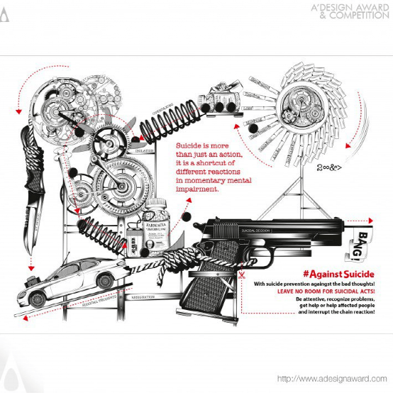
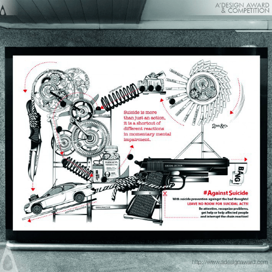
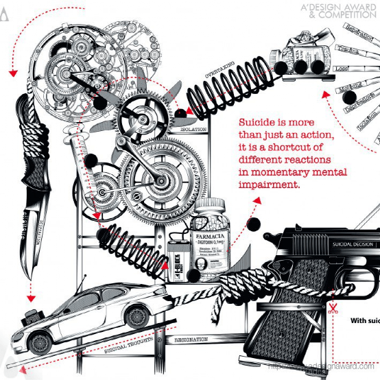
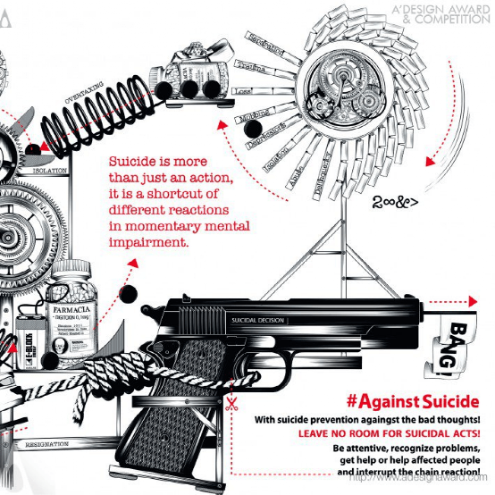
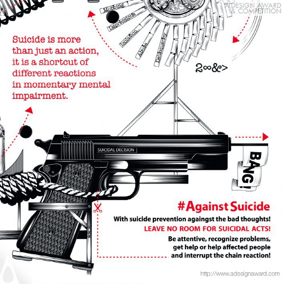
INSPIRATION:
Thoughts of suicide can affect anyone, at any time in life. In these difficult times, isolation and social pressures are increasing problems. On the other hand, Depressions are still a taboo and a stigma. Those affected often remain silent until the thoughts start to cycle and in the worst case, the can turn into a suicidal chain reaction. Suicide and depressions are a taboo topic.
灵感:
自杀的想法可以影响任何人,在生命中的任何时候。在这些困难时期,与世隔绝和社会压力是越来越多的问题。另一方面,抑郁症仍然是一种禁忌和耻辱。受影响的人通常保持沉默,直到思想开始循环,在最坏的情况下,这种想法可能会变成自杀连锁反应。自杀和抑郁是一个禁忌话题。
ZhenYue logo and Brand Identity by Guangzhou Cheung Ying Design Co. Ltd.
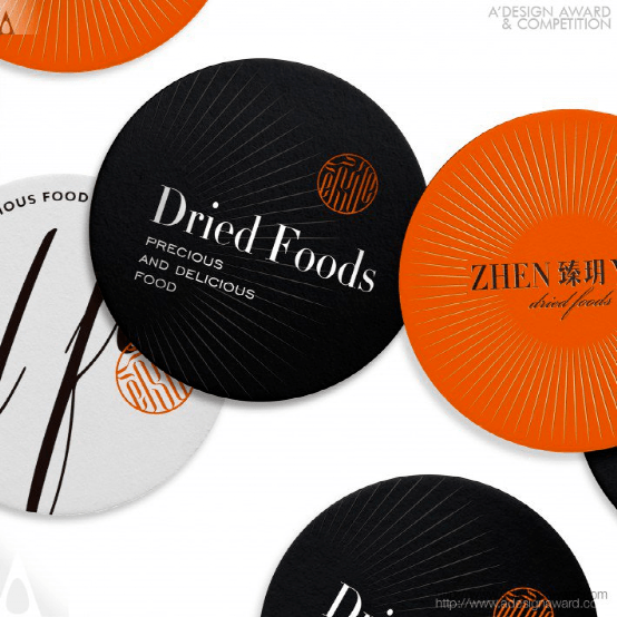
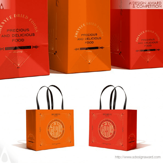
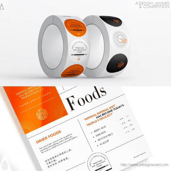
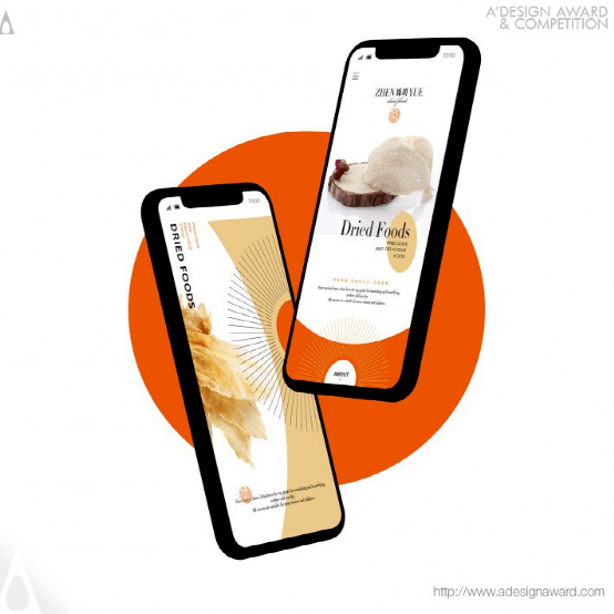
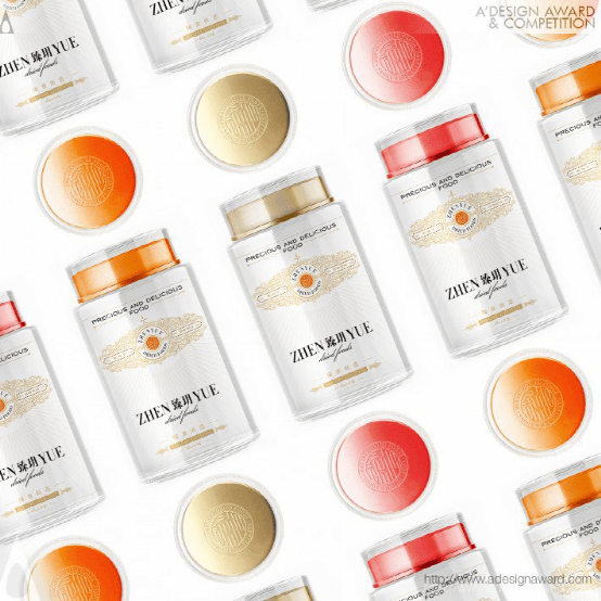
INSPIRATION:
As one of the characteristic traditional crafts in China, the most significant feature of dried foods is that it is dehydrated by slow drying in the sun. Therefore, in the design of the new brand logo, the traditional bamboo sieve drying form and the weaving process are combined, and the brand name letters "z, h, e, n, y, u, e " are interspersed and linked to each other, so that the arrangement form of each letter makes it look like the collection of different dried foods in the bamboo sifter, which interprets the connotation of the brand name of " ZhenYue ", and brings out the beautiful meaning of " ZhenYue Selection, High-quality Gathering" as a whole.
灵感:
干燥食品是我国传统工艺的一大特色,其最大的特点是在阳光下缓慢干燥脱水。因此,在新品牌标识的设计中,将传统的竹筛干燥形式与编织工艺相结合,将品牌名称字母“z、h、e、n、y、u、e”穿插在一起,相互联系,使每个字母的排列形式看起来像是竹筛中不同干燥食品的集合,阐释了“振跃”品牌的内涵,从整体上揭示了“振跃精选,优质汇聚”的美好内涵。
GAAHK Inauguration Ceremony Key Visual Design by Alex King
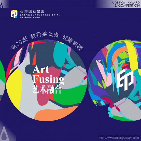
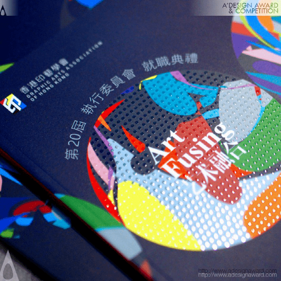
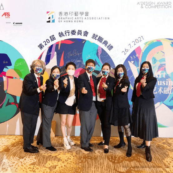
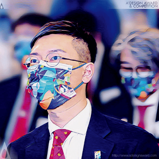
INSPIRATION:
This project is an invitation project that covers a wide range of adaptation, including digital backdrop, sign board, brochure, invitation card, souvenir and mask.Through capturing the magical moment of an artisan who is mixing various vivid colors to create masterpiece of print works. The present design signifies the Art of Fusing between visual designers and experienced print makers - co-creating a new form of object of desire using colors and foils (digital prints). We never know the end result and that is why we keep trying each time.
灵感:
本项目是一个邀请项目,涵盖了广泛的改编,包括数字背景、标志牌、小册子、邀请卡、纪念品和面具。通过捕捉一位工匠的神奇时刻,他将各种生动的颜色混合在一起,创造出印刷作品的杰作。目前的设计意味着视觉设计师和经验丰富的印刷制造商之间的融合艺术――使用颜色和箔(数字印刷品)共同创造一种新的欲望对象形式。我们永远不知道最终结果,这就是为什么我们每次都在尝试。
Budapest Giftbook Graphic Design by Botond Voros
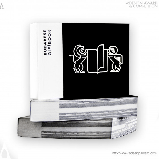
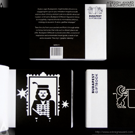
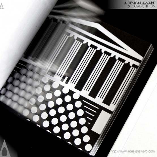
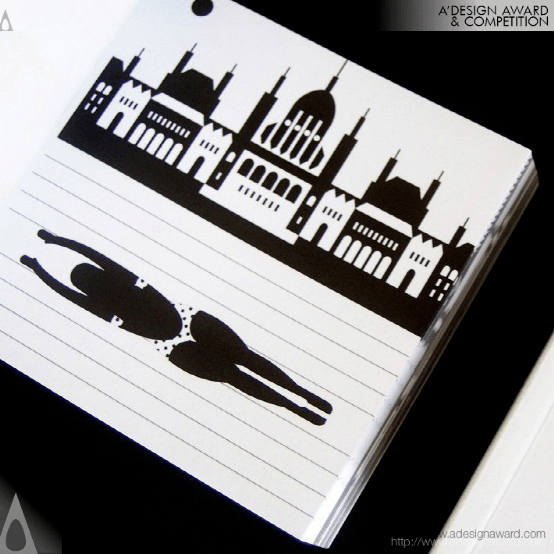
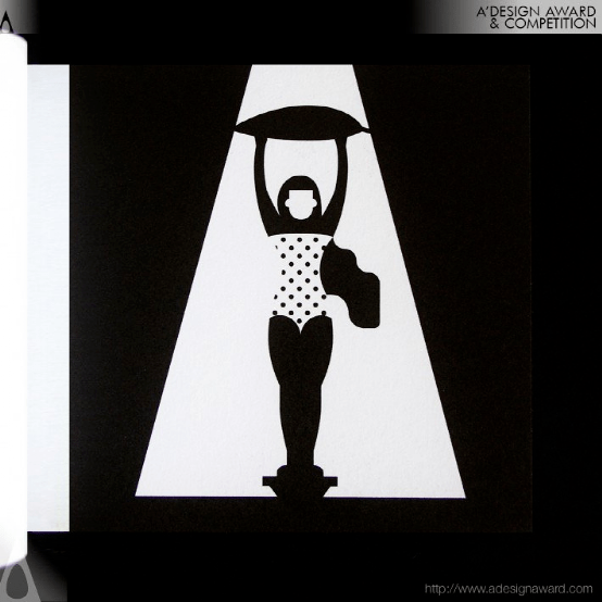
INSPIRATION:
The design was inspired by all that one loves about Budapest. The atmosphere, the ambient streets, historical buildings and busy squares. The Danube, a river that is international to the core, divides as much as it connects the two individual parts: Buda and Pest. The cultural impressions (landmarks, buildings, cuisine, nightlife and arts) were the main motives during the designing process.
灵感:
设计灵感来源于人们对布达佩斯的热爱。气氛,周围的街道,历史建筑和繁忙的广场。多瑙河是一条国际性的河流,它将布达河和佩斯特河这两个独立的部分连接起来,并将其分开。文化印象(地标、建筑、美食、夜生活和艺术)是设计过程中的主要动机。
Crcrta Corporate Identity by Zilong Chen and Chao Yang
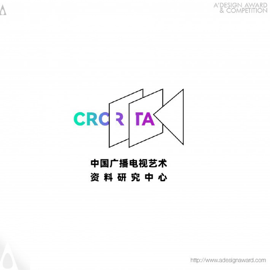
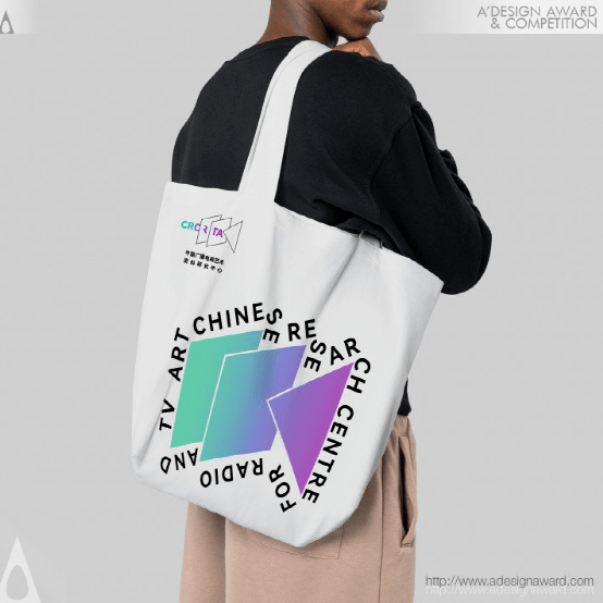
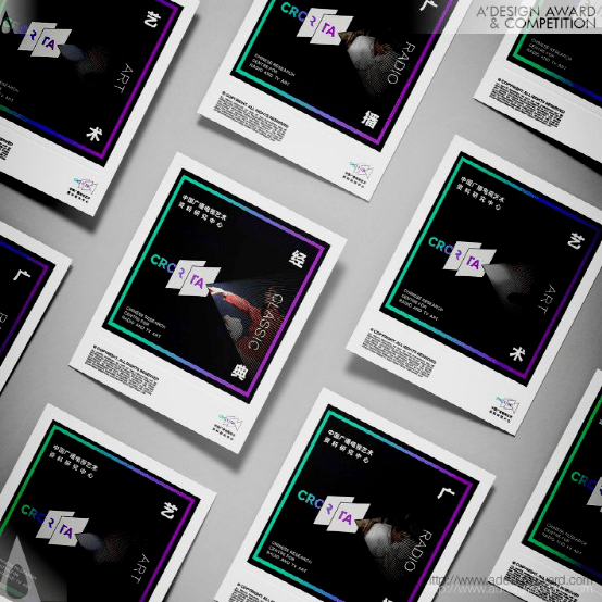
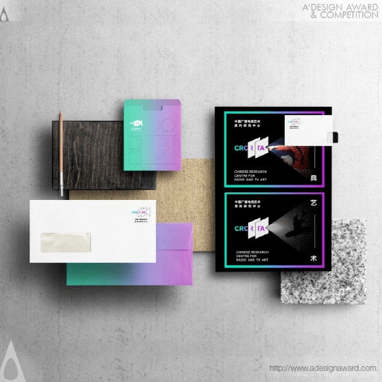
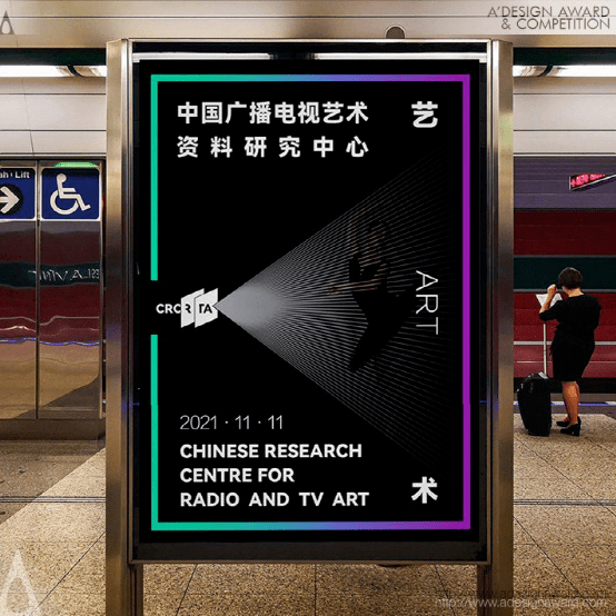
INSPIRATION:
The Chinese Research Centre for radio and TV art was founded in 2021 and needs to design a visual image of government departments. It is an enterprise for sorting and preservation, publicity and display, art research and talent training, so as to play a positive leading role in strengthening TV art exchange, deepening academic research and carrying forward the spiritual connotation of works.
灵感:
中国广播电视艺术研究中心成立于2021,需要设计政府部门的视觉形象。是整理保存、宣传展示、艺术研究和人才培养的企业,对加强电视艺术交流、深化学术研究、弘扬作品精神内涵起到积极的引领作用。
Plasma Sf Typeface Design by Paul Robb
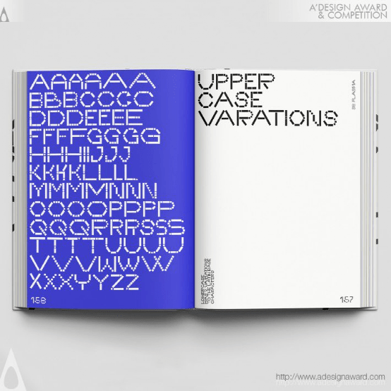
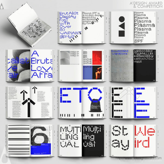
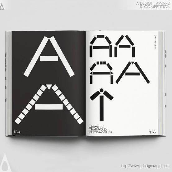
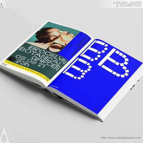
INSPIRATION:
The idea behind the font was the brutalist architecture around the Southbank in London. Using the idea of the form found of negative circles constructed within the building, and the strong blocks and dramatic triangles of light. The font is an ever ending construction project with infinite combinations both in upper and lowercase glyphs
灵感:
字体背后的理念是伦敦南岸附近的野蛮主义建筑。利用建筑内部的负向圆的形式,以及强光块和引人注目的三角形。该字体是一个永无止境的建设项目,有无限的大小写符号组合。

全部评论